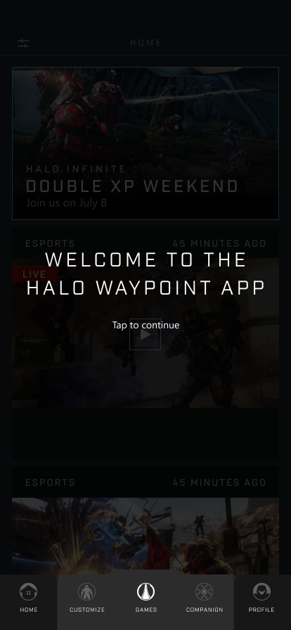
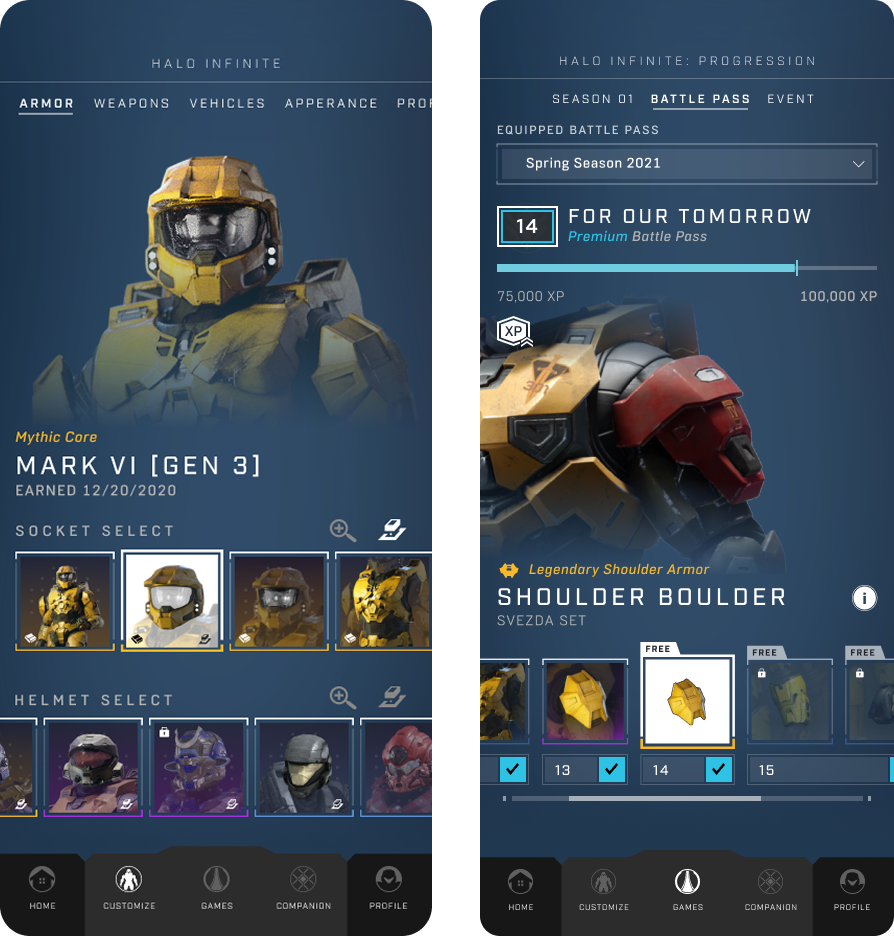
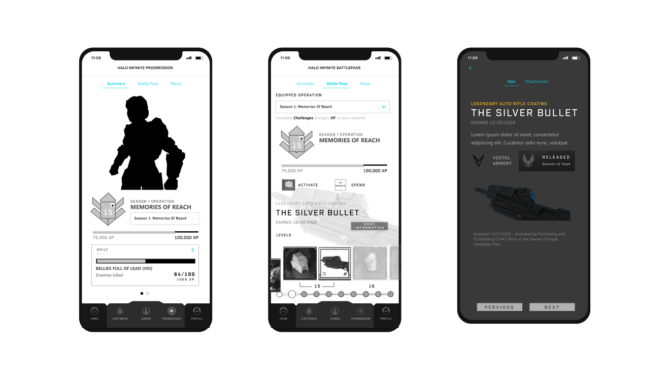
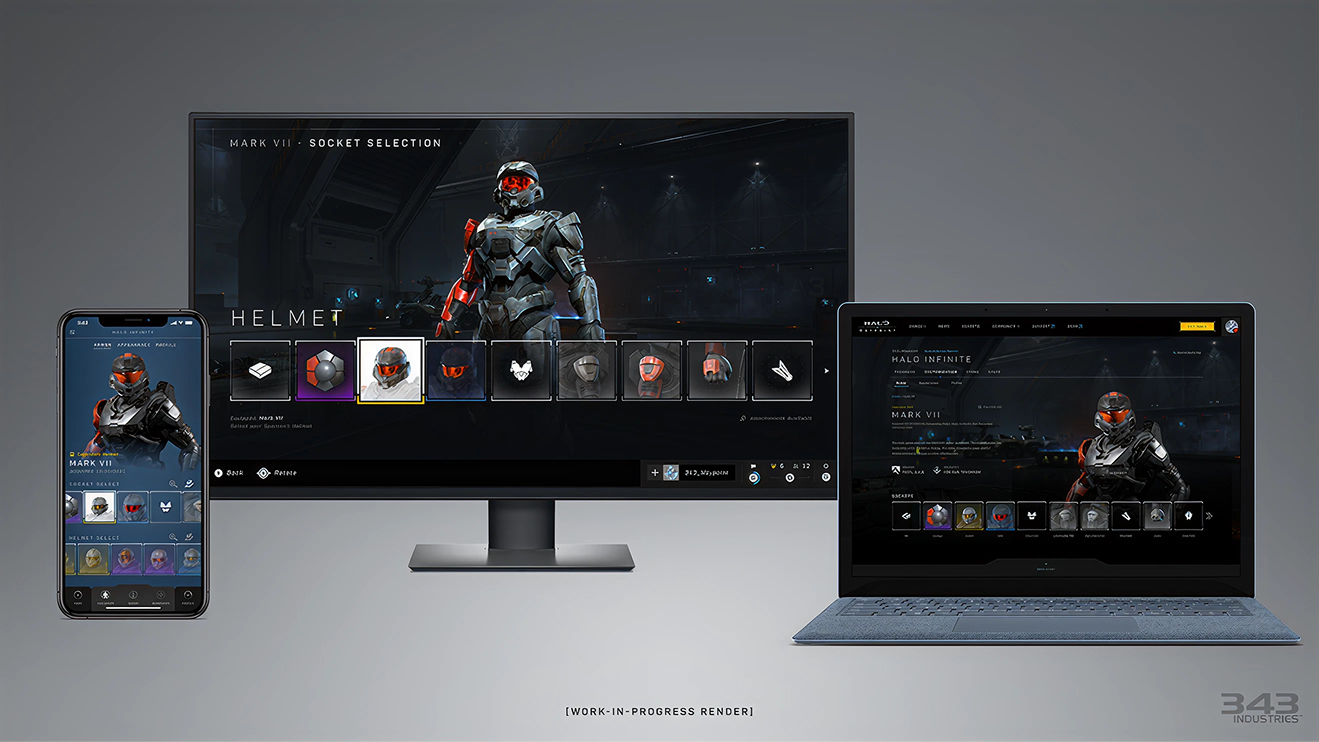
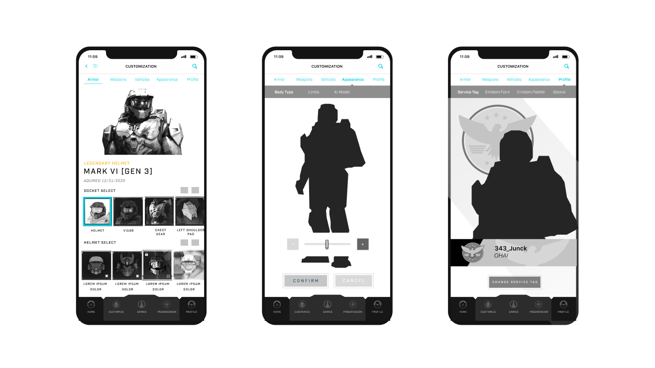
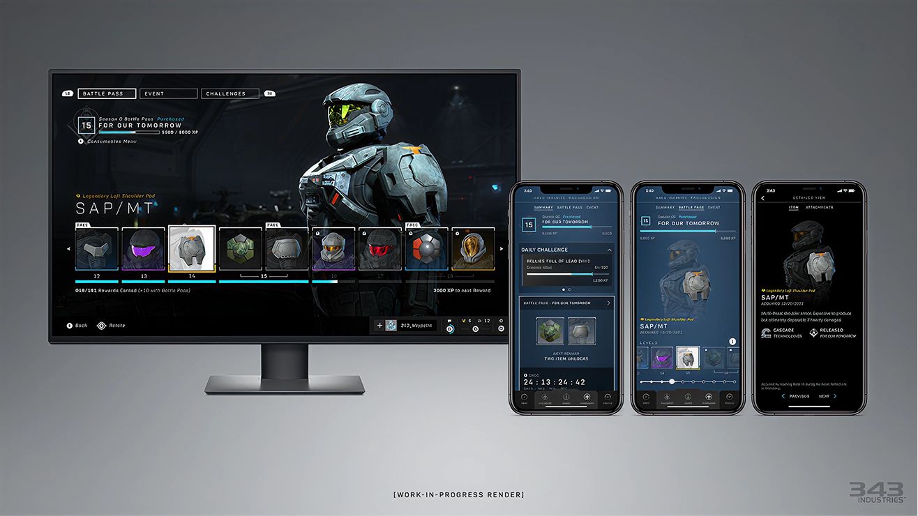
One App.
Twenty Years.
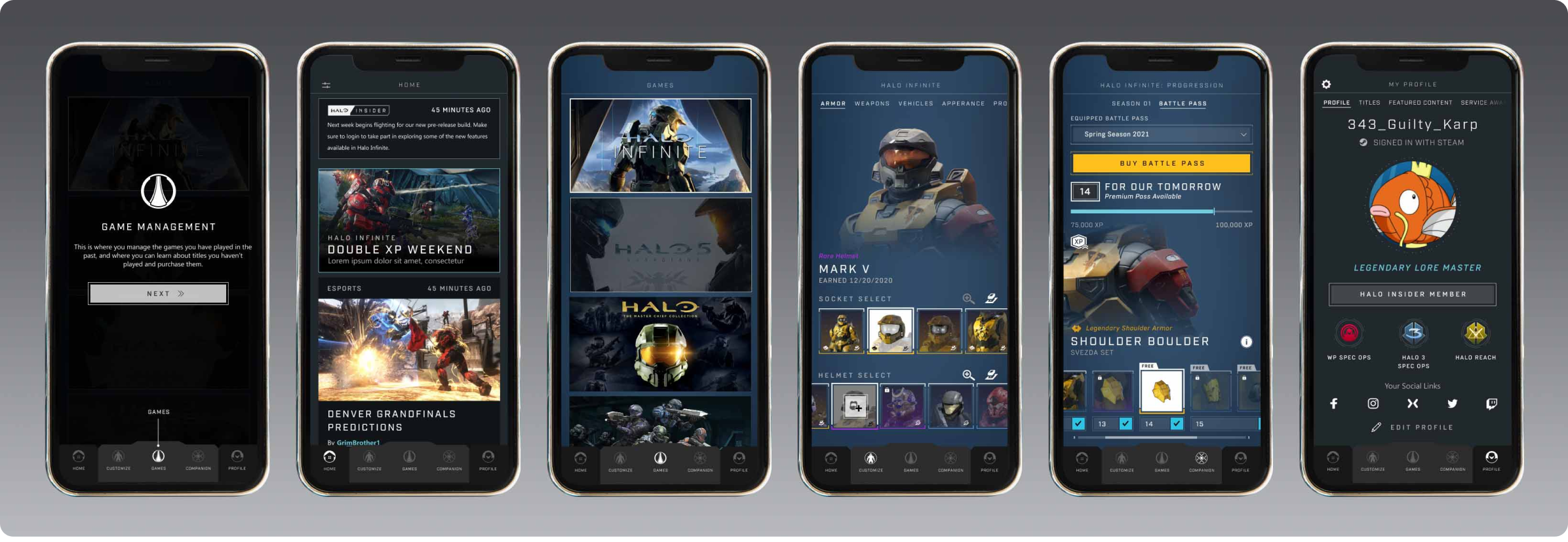
Role
Lead UX — Halo Waypoint
Owned the full product experience across iOS and Android: IA, navigation, onboarding, core flows, and research.
Responsibilities
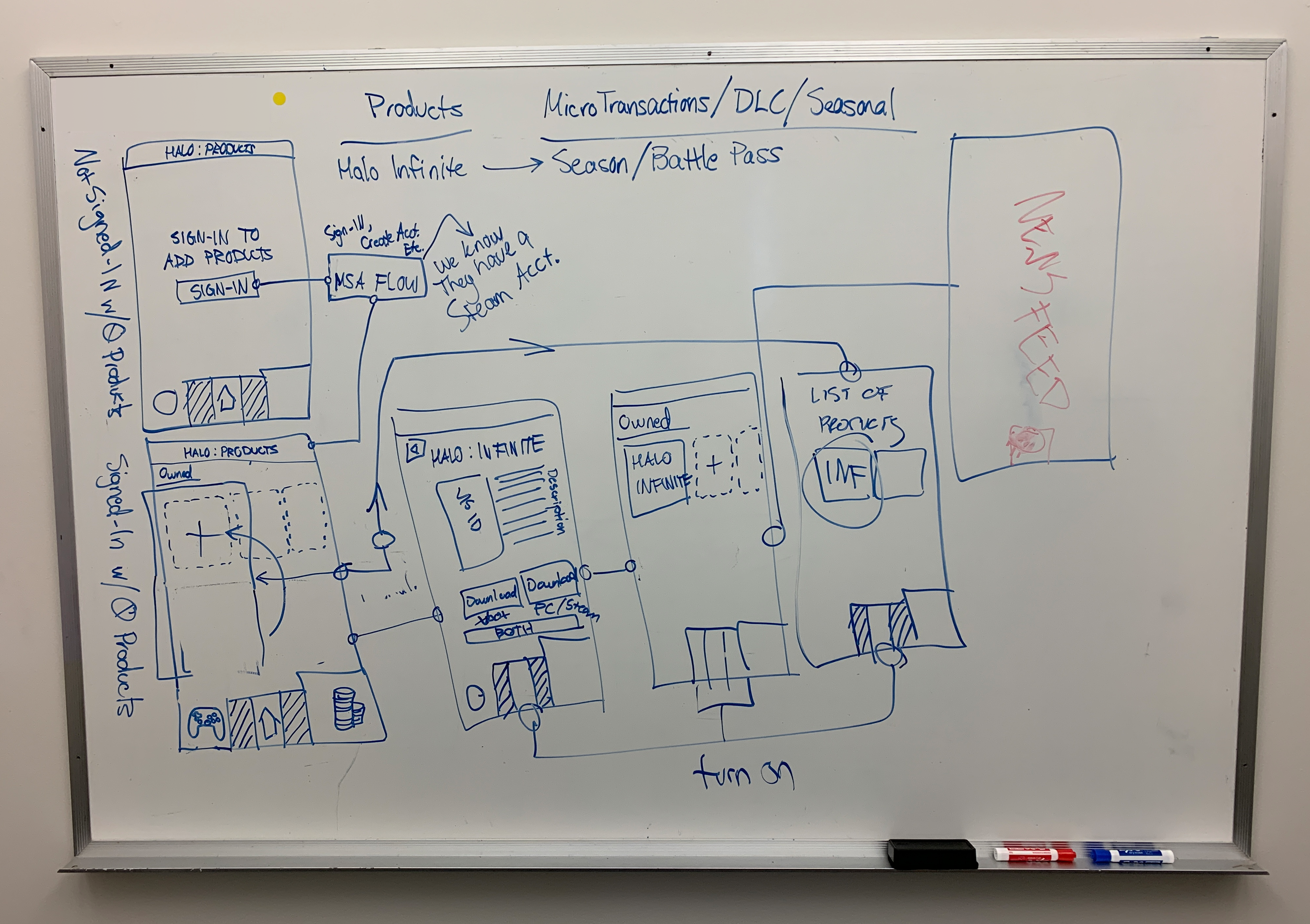
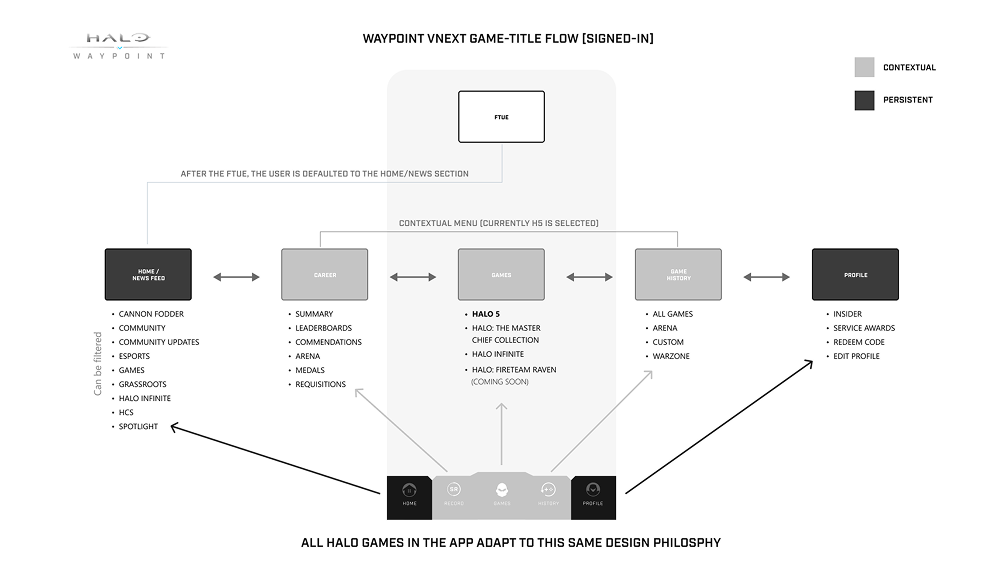
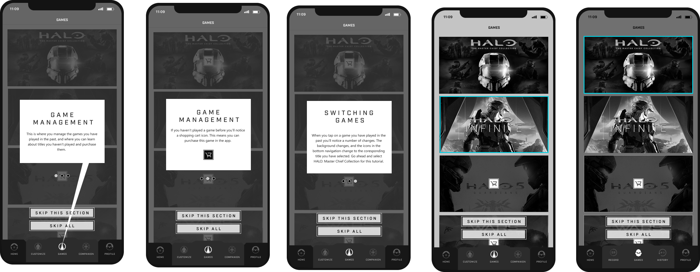
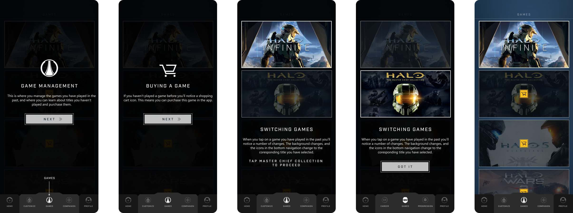
Problem definition
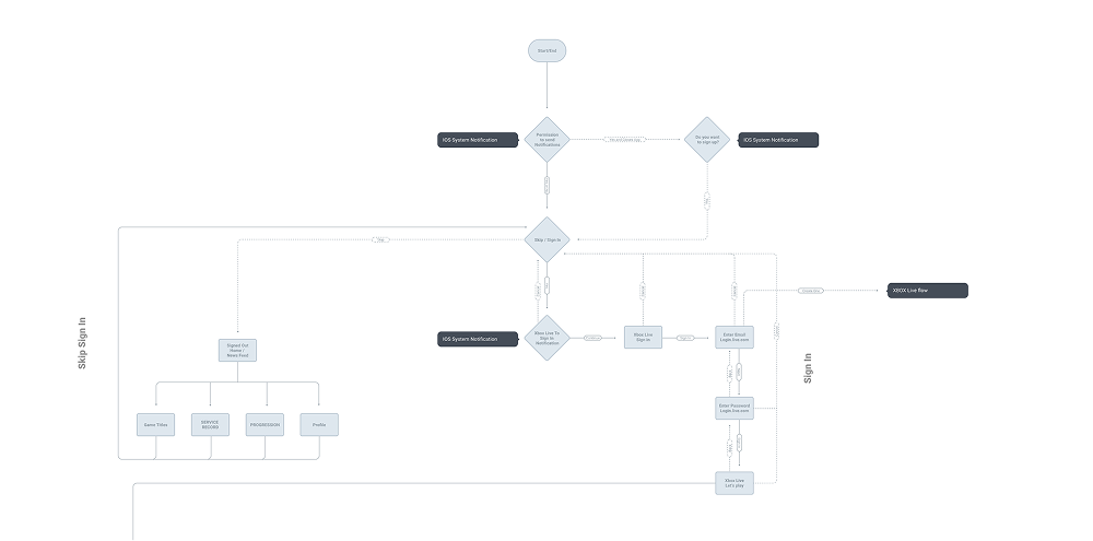
User flows
Information architecture
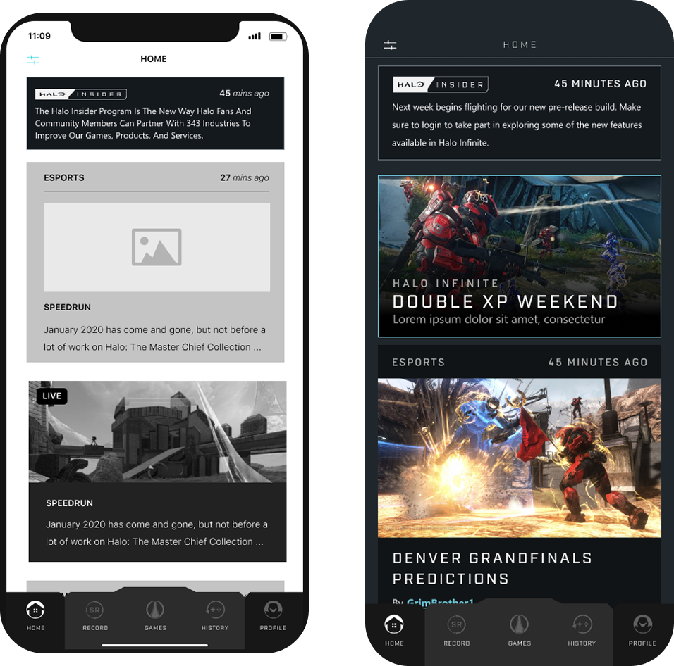
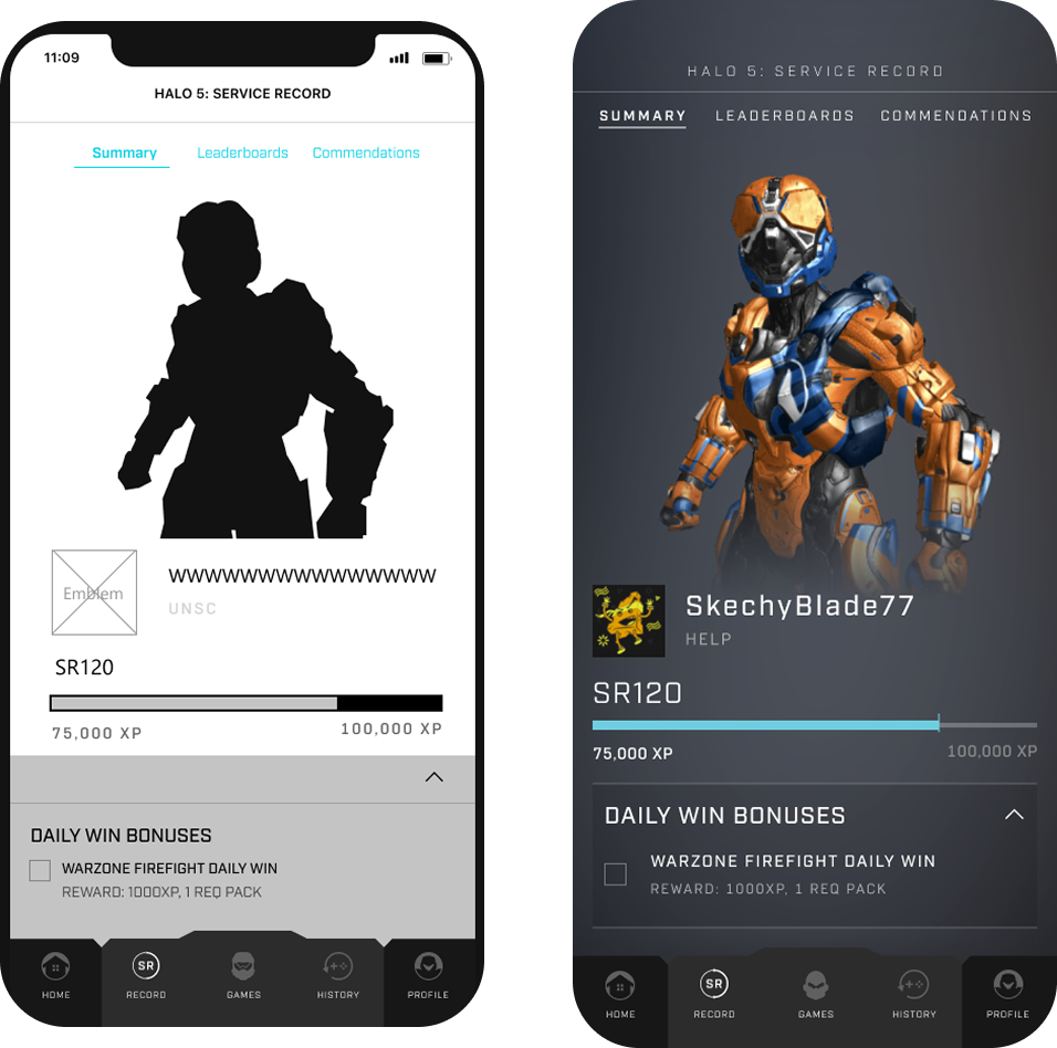
Wireframes
Prototype and validation
Team
3 Engineers · 1 PM · 2 Artists
Date
2021
The Problem
Halo Channel was gone.
Players had nowhere to go.
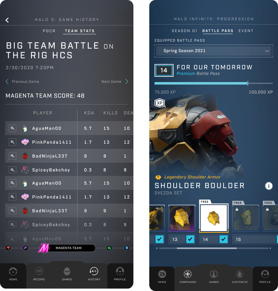
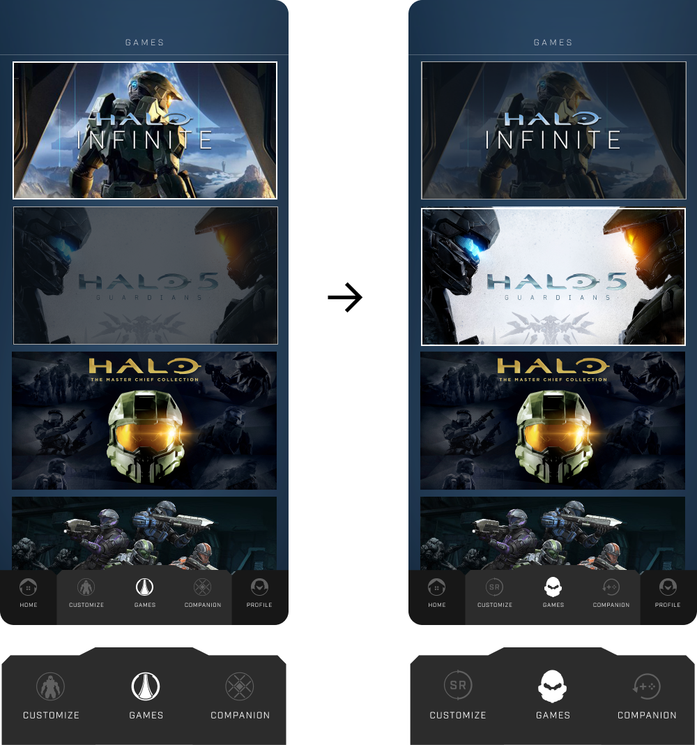
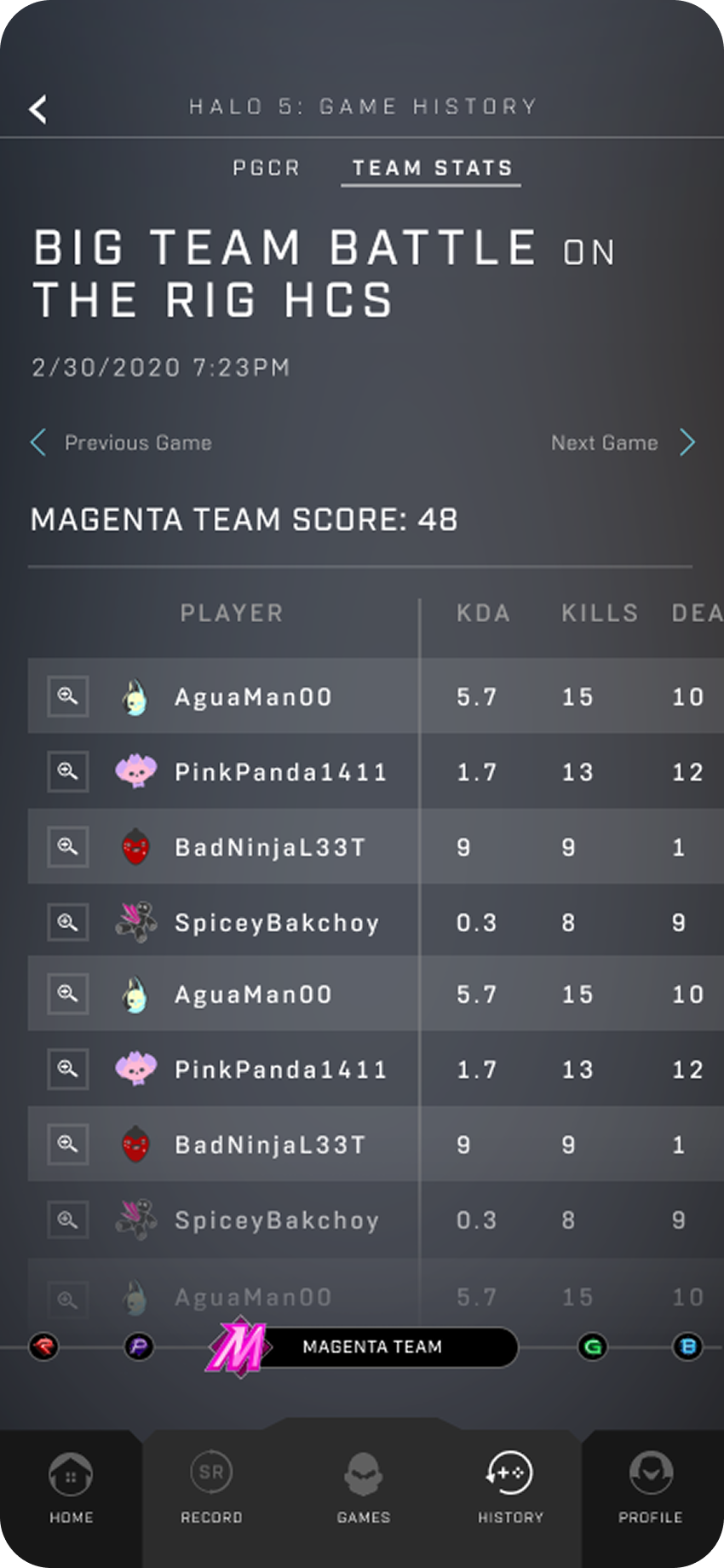
Halo Channel was canceled years ago. For five years players had nowhere to go. A browser. A console. Nothing built for the pocket. Each title carried its own data model. Twenty years of history with no single place to hold it.
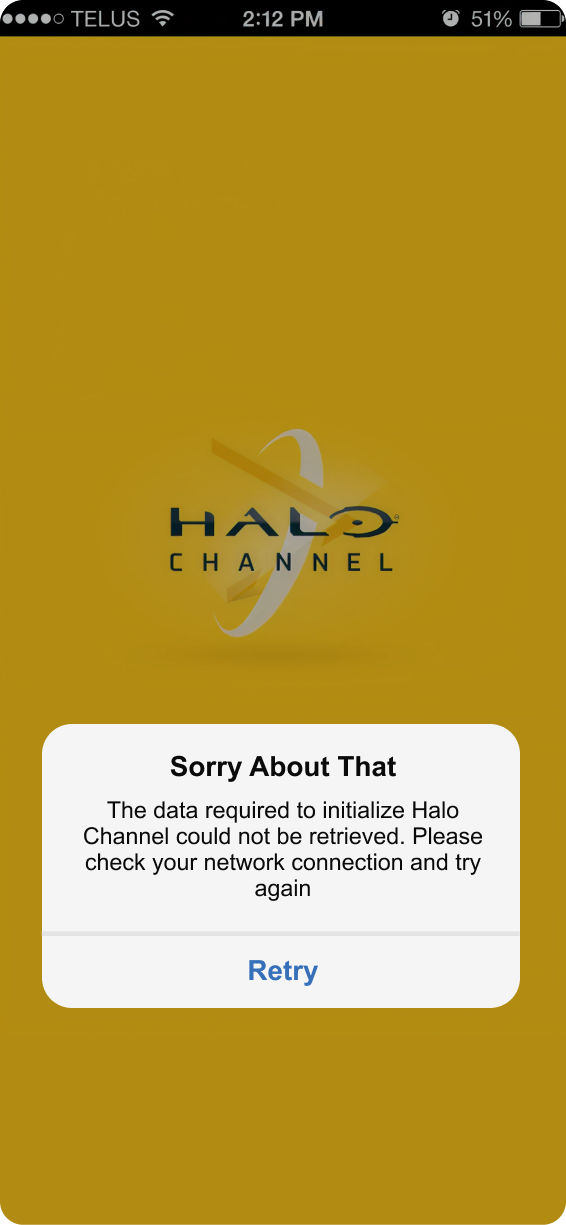 Before — Halo Channel App