Deep Upgrades.
Zero Regret.
Role
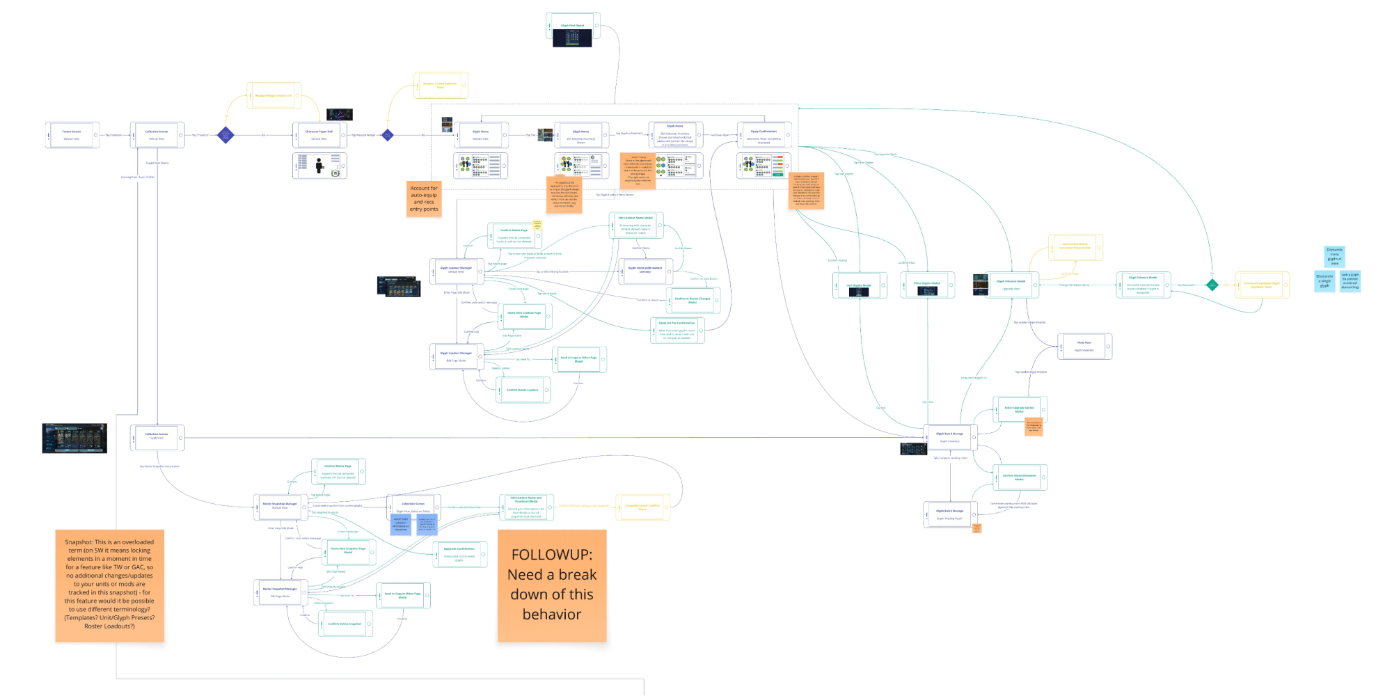
Lead UX — Glyphs & Relics
Owned the UX process and interaction models from pre-production through launch. PC and mobile.
Responsibilities
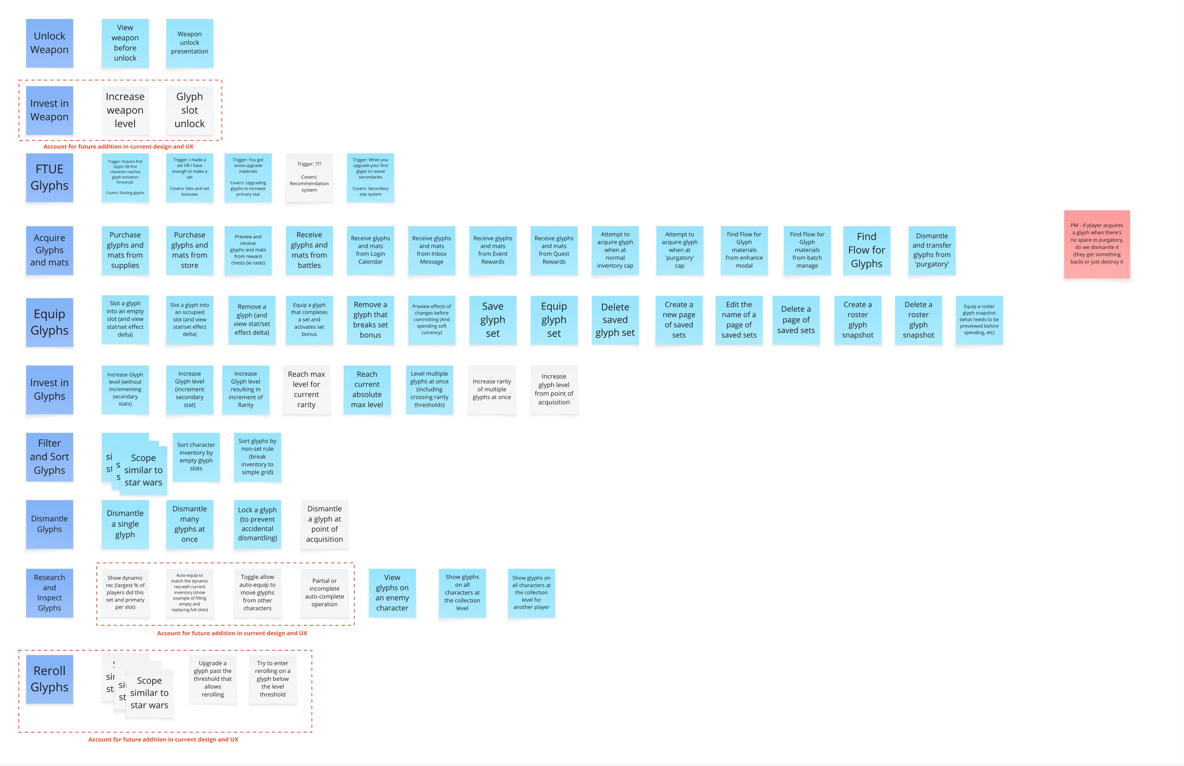
Problem definition
Audience analysis
Player verbs
Player paths
Information architecture
Wireframes
Motion target critiques
Team
6 Eng · 1 GD · 1 PM · 2 Art · 1 UX Dir · 1 Audio
Date
November 2023
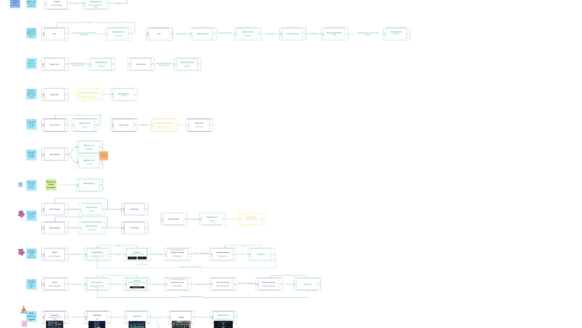
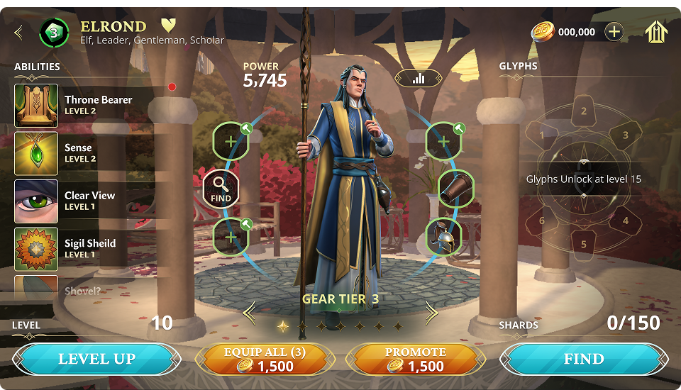
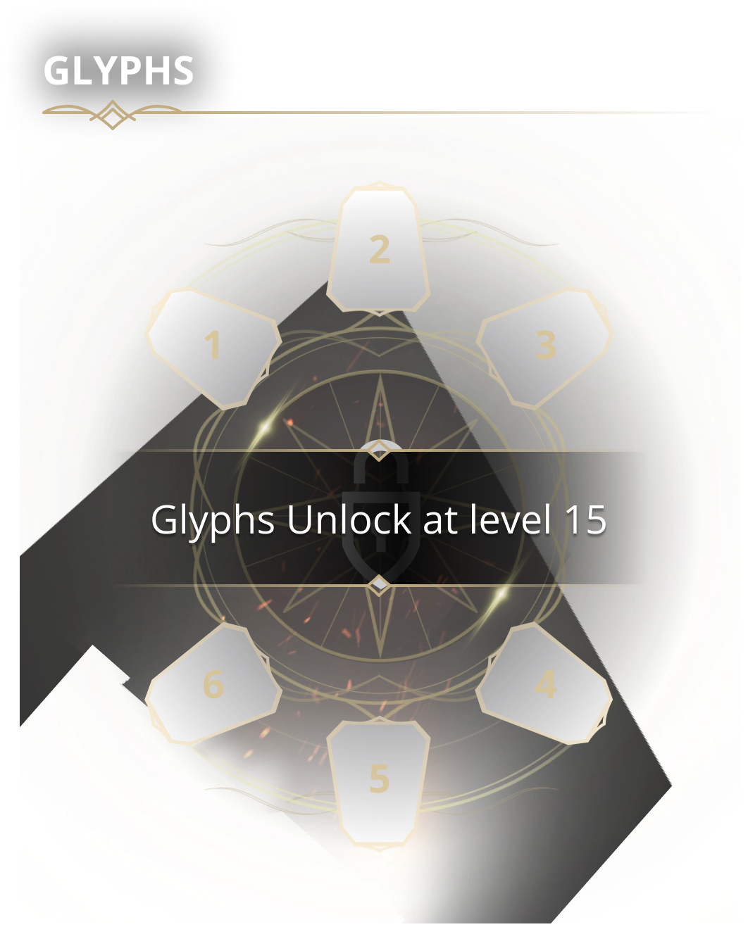
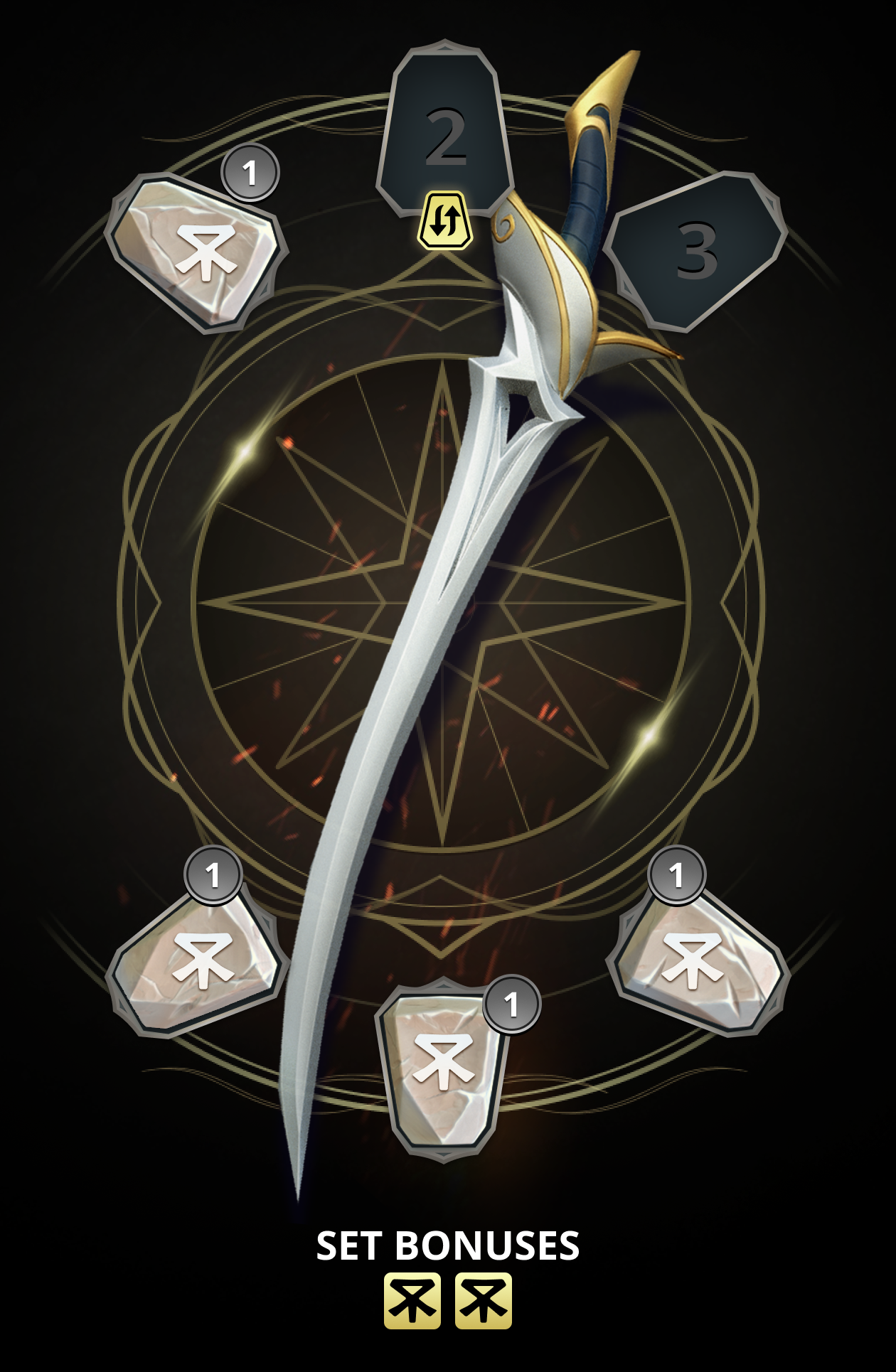
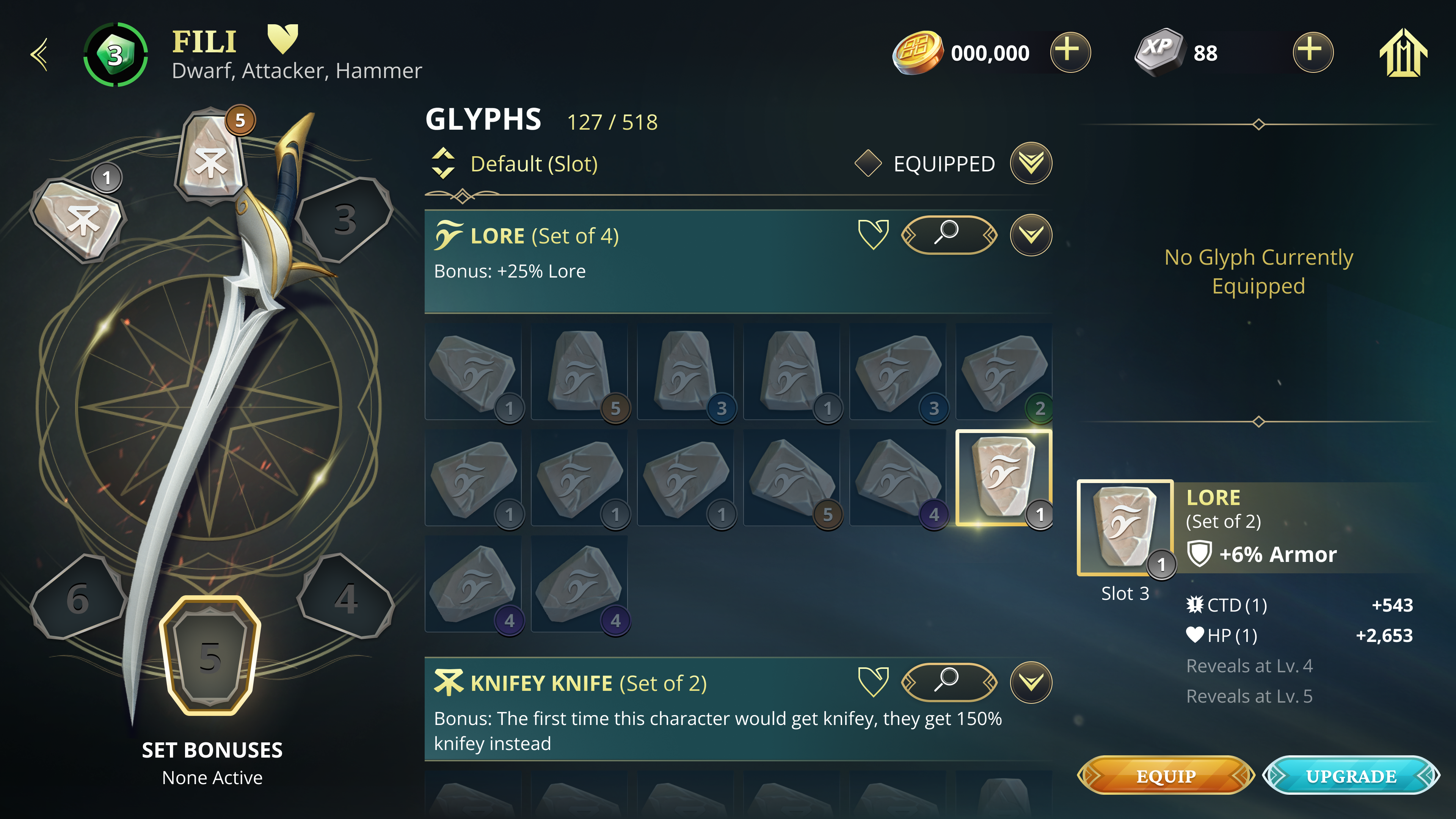
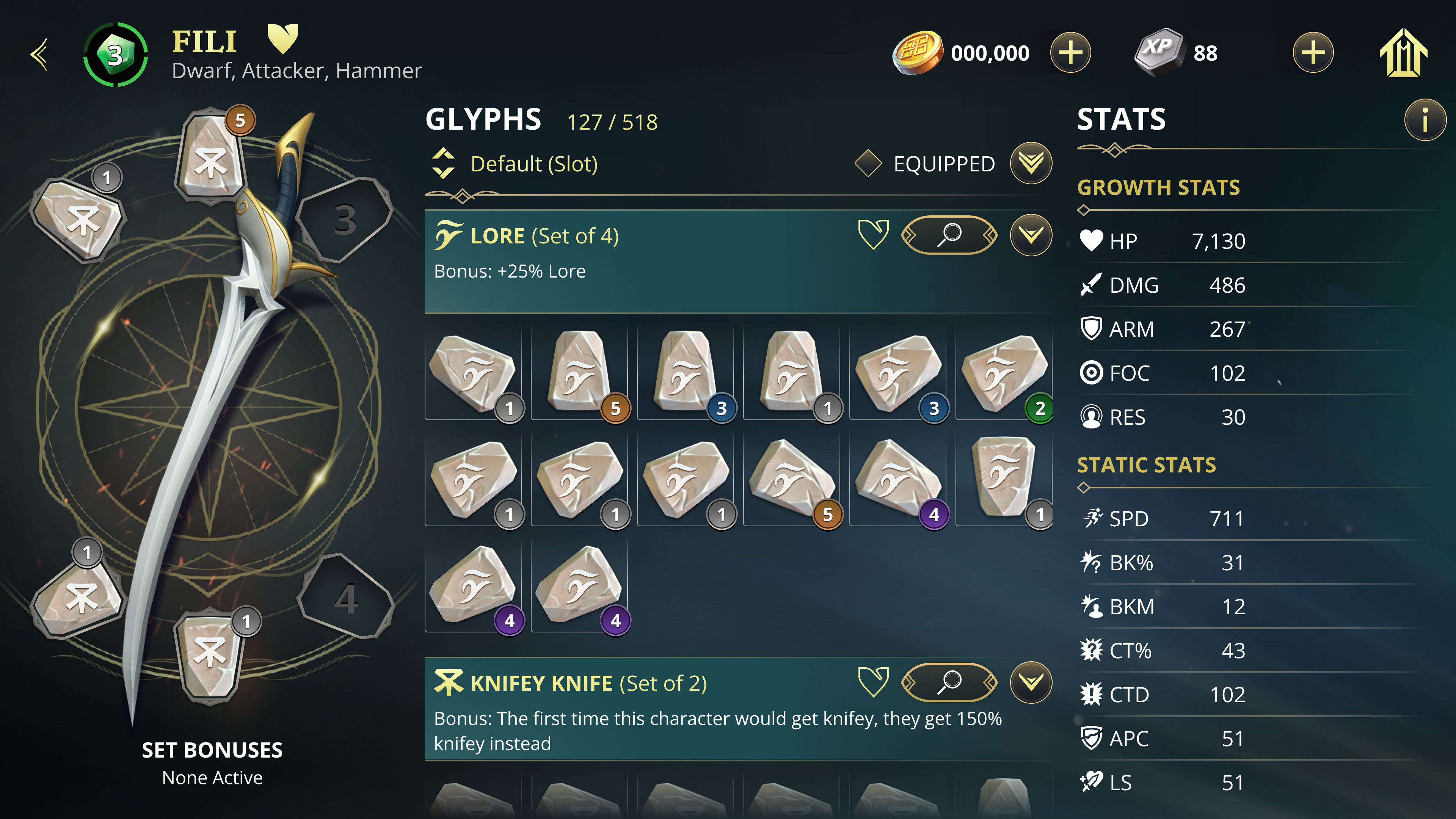
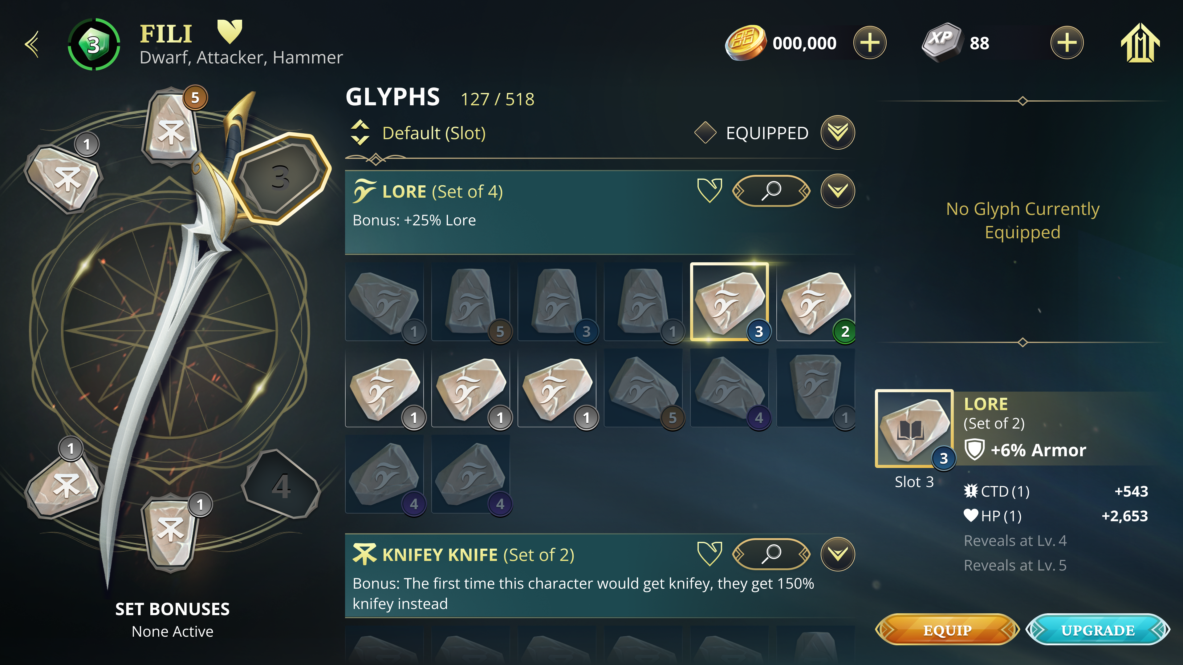
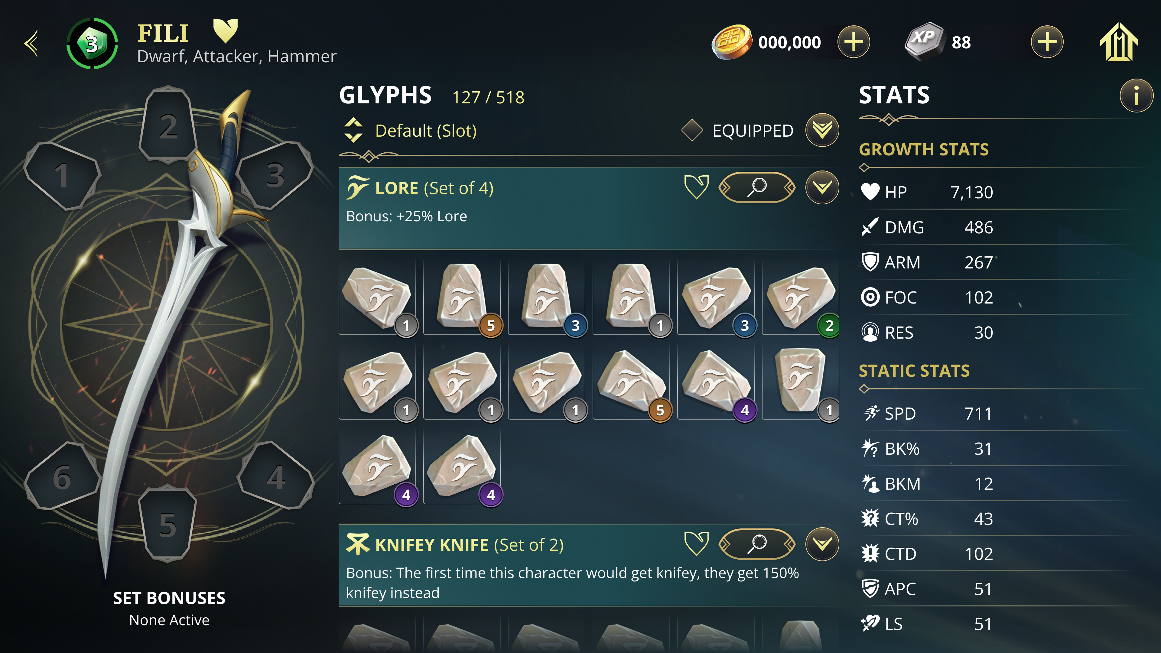
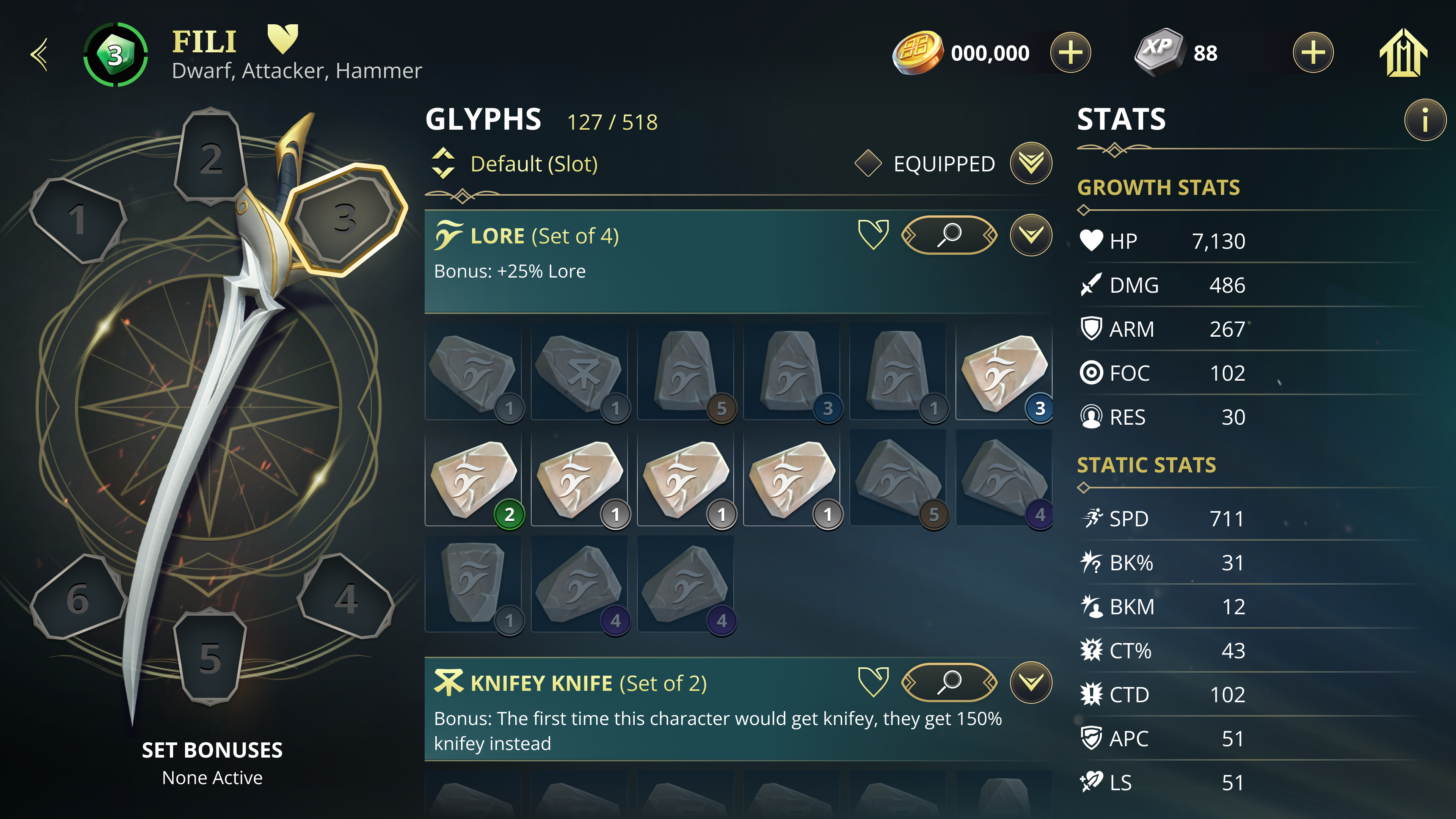
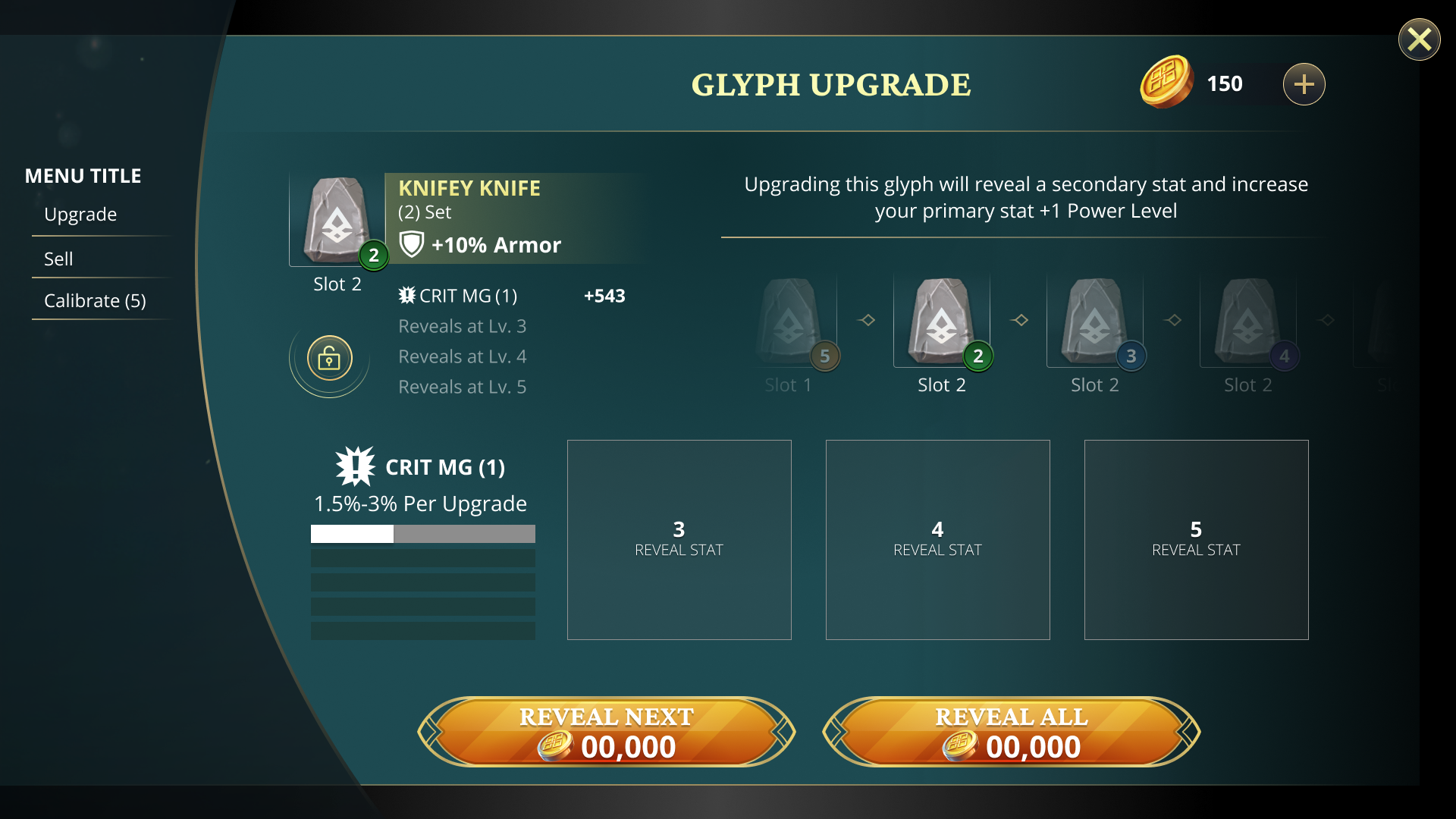
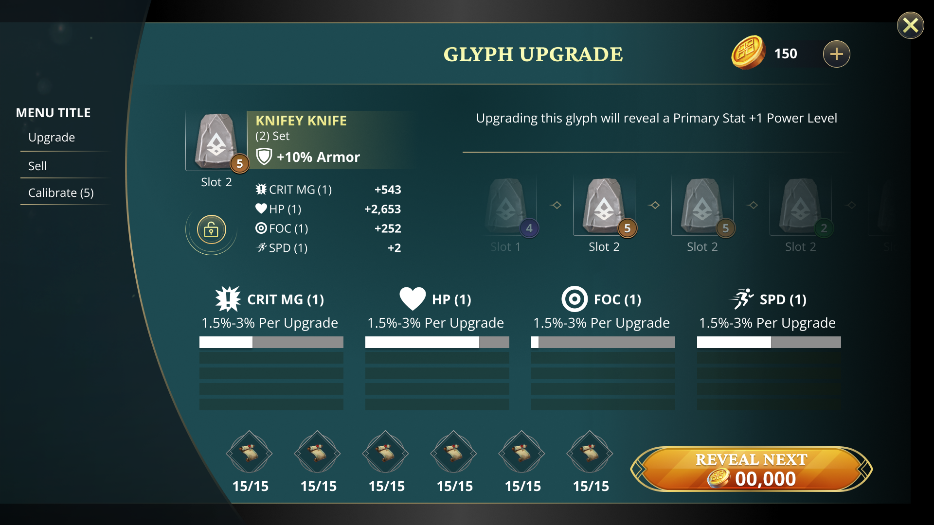
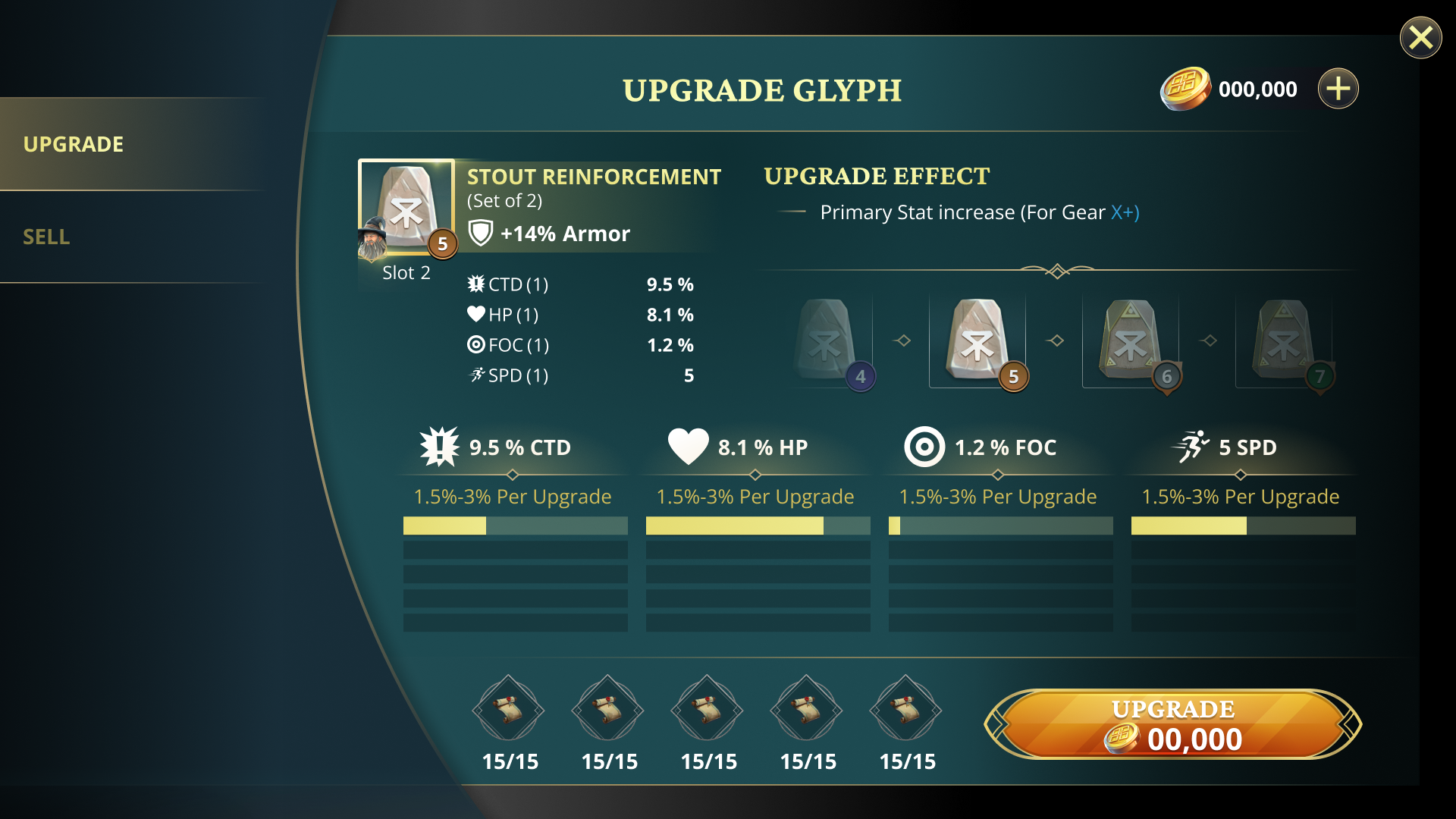
The Problem
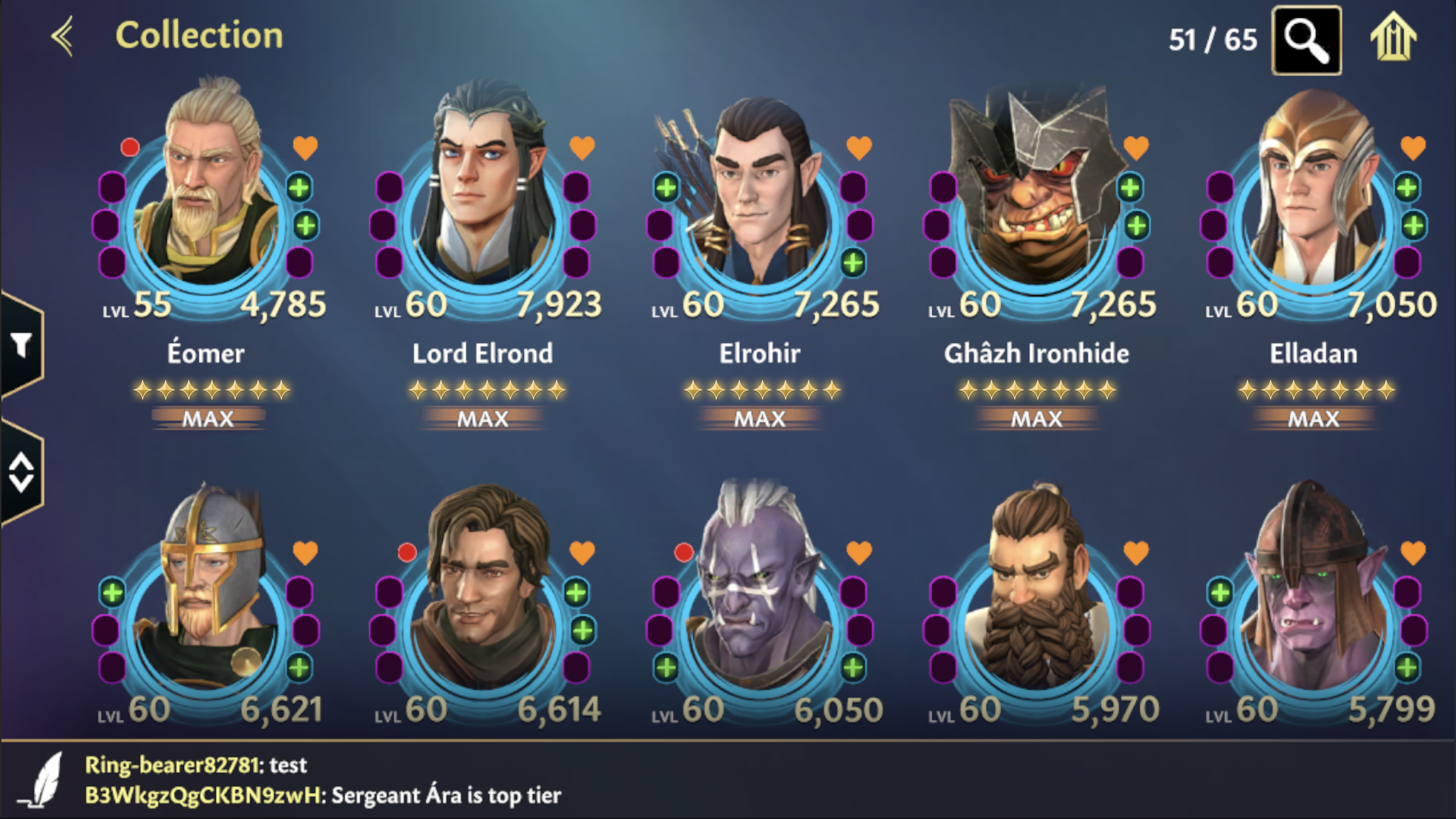
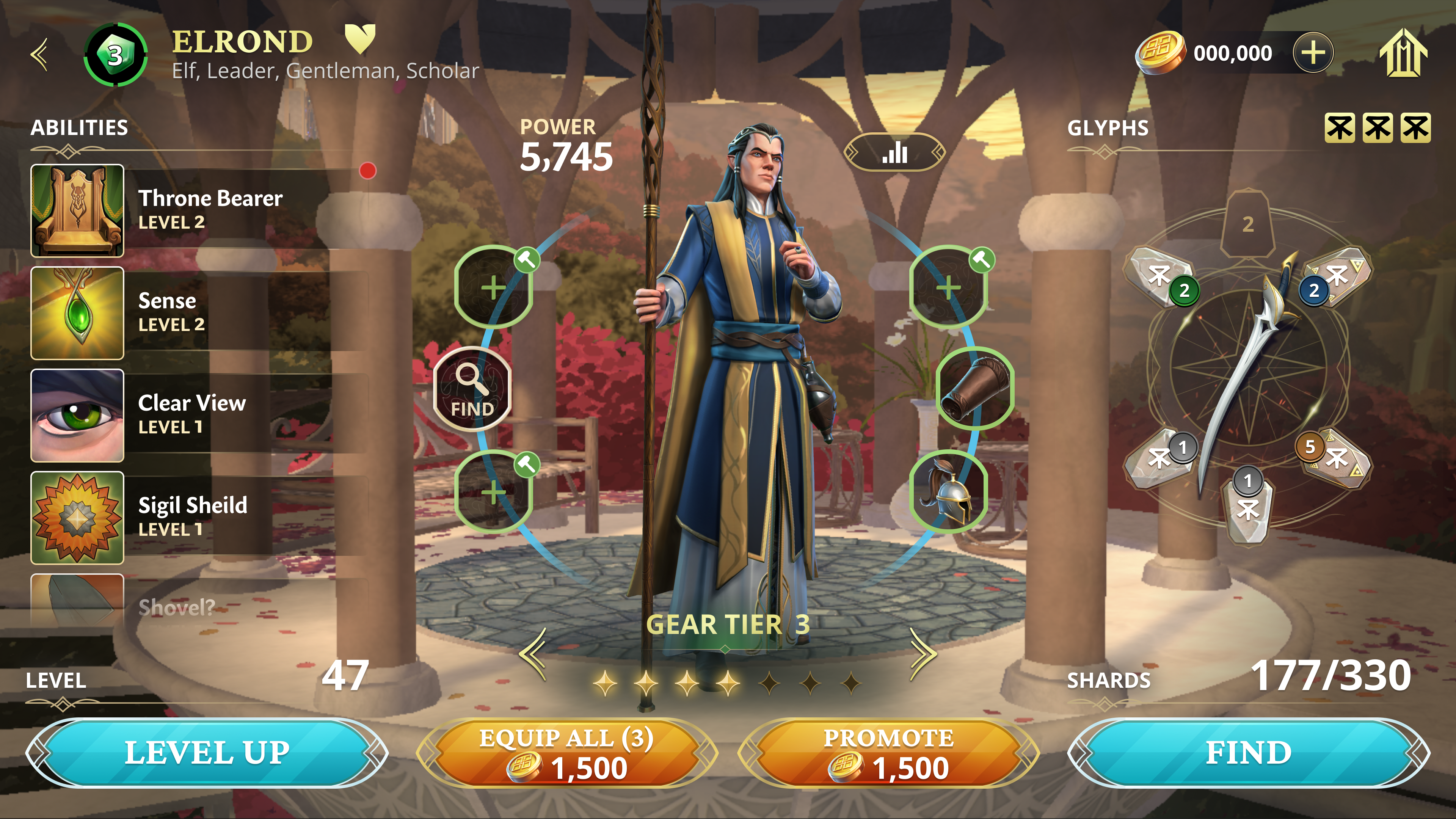
Progression had a ceiling.
Players had hit it.
Players had mastered the upgrade loop and hit a wall. Gear, abilities, and leveling all had a ceiling. There was no way to make your heroes feel like yours. Without something new to chase, there was no reason to keep investing.
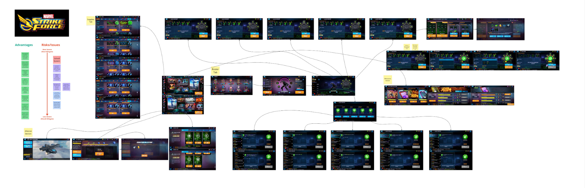
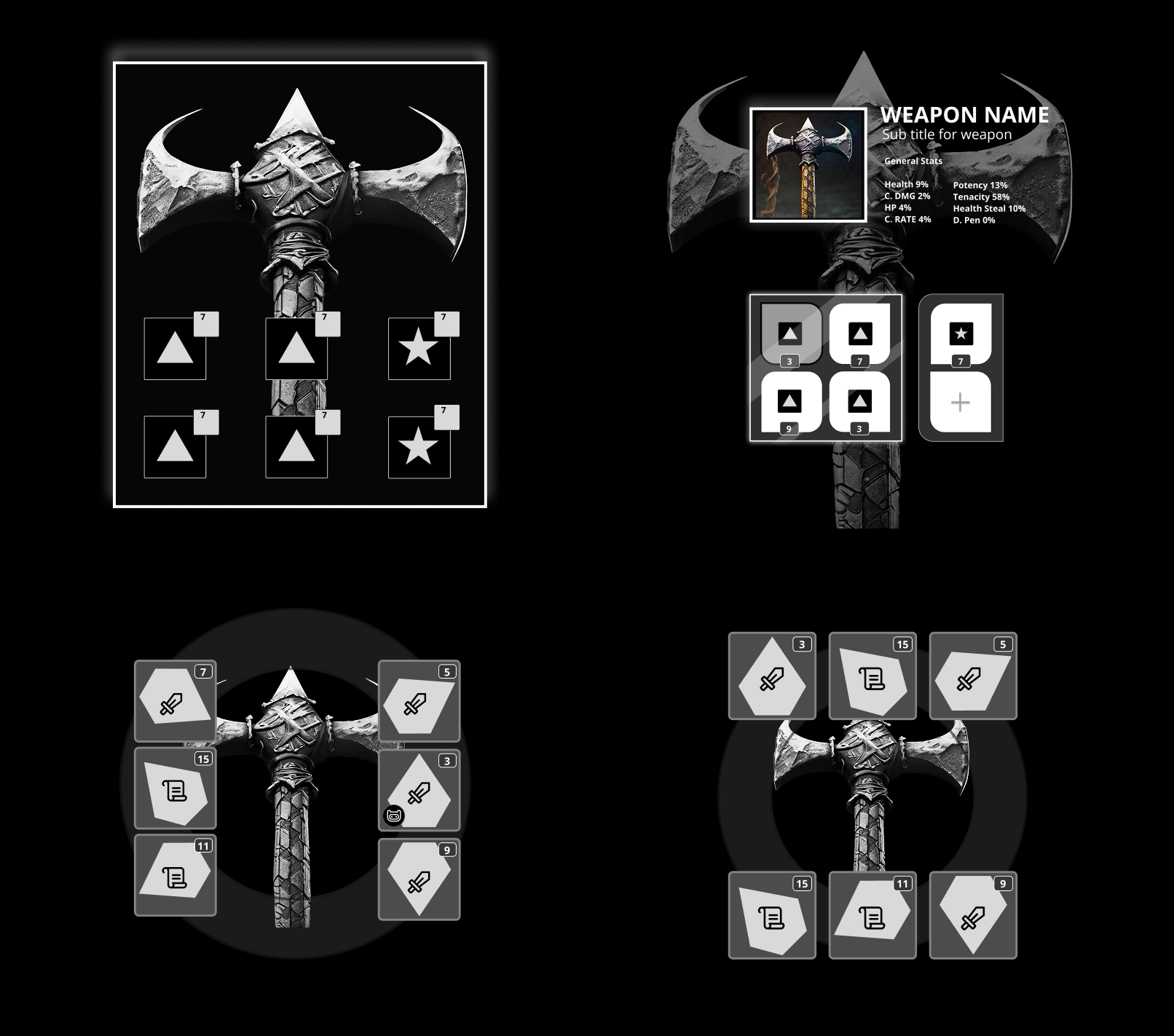
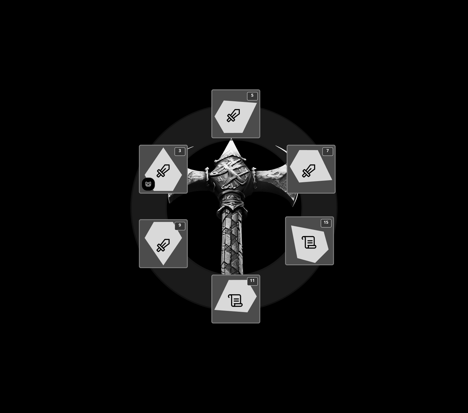
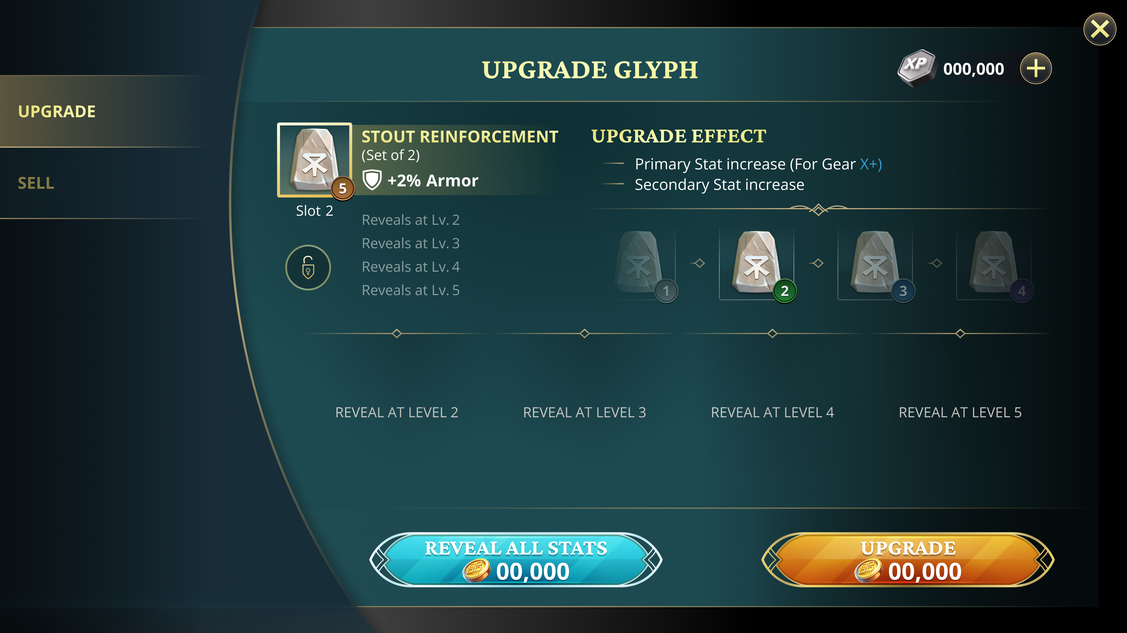
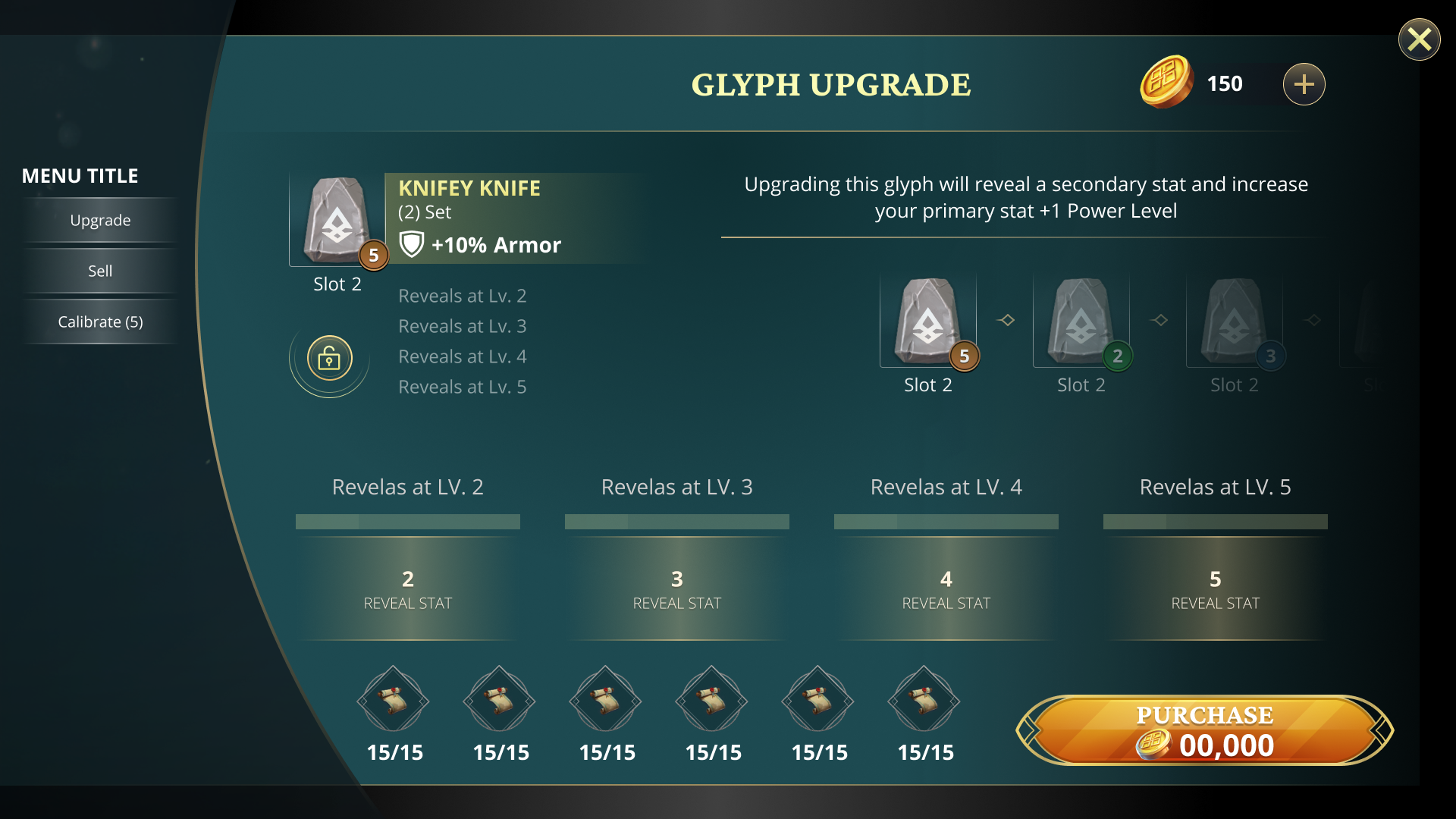
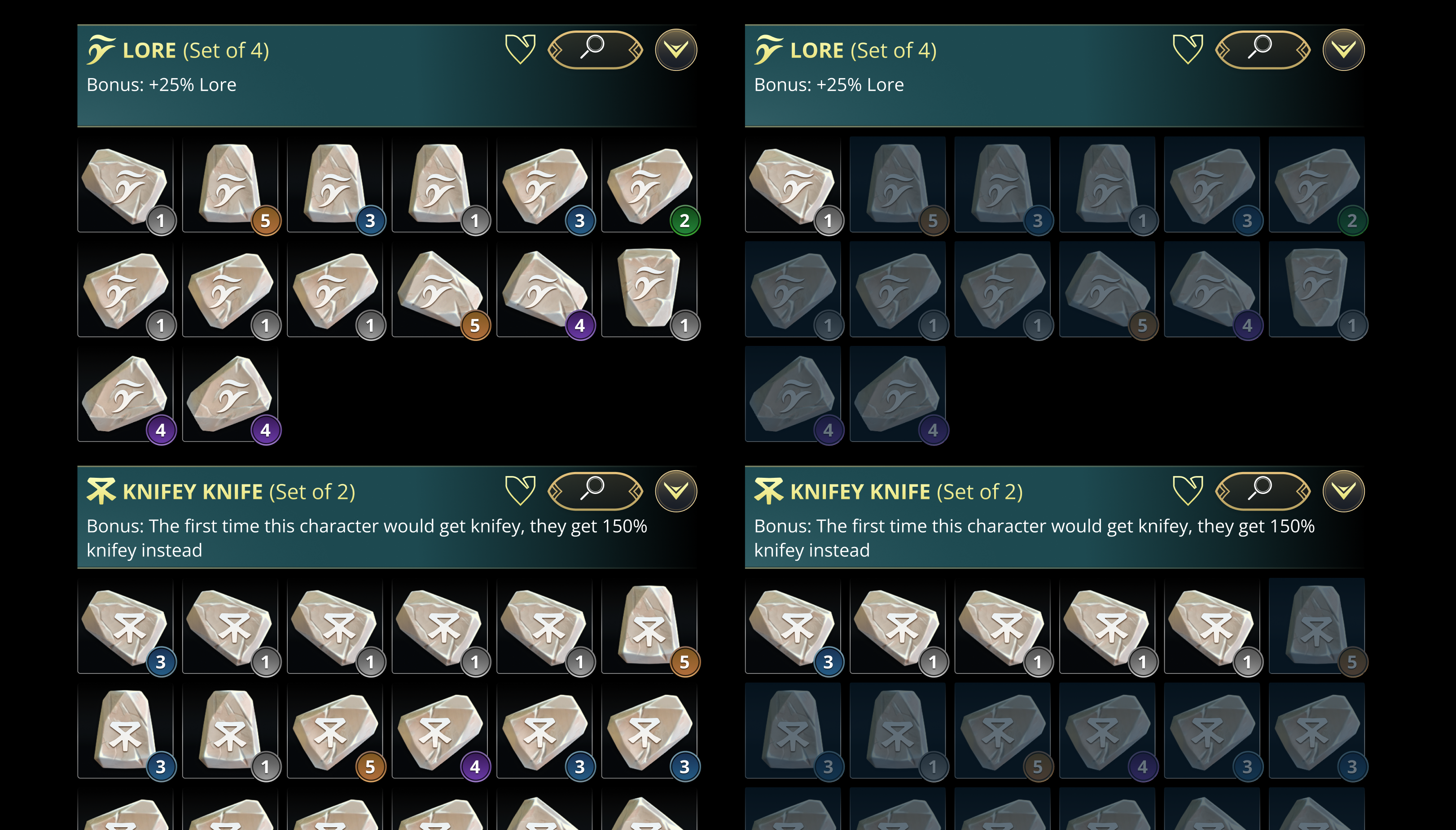
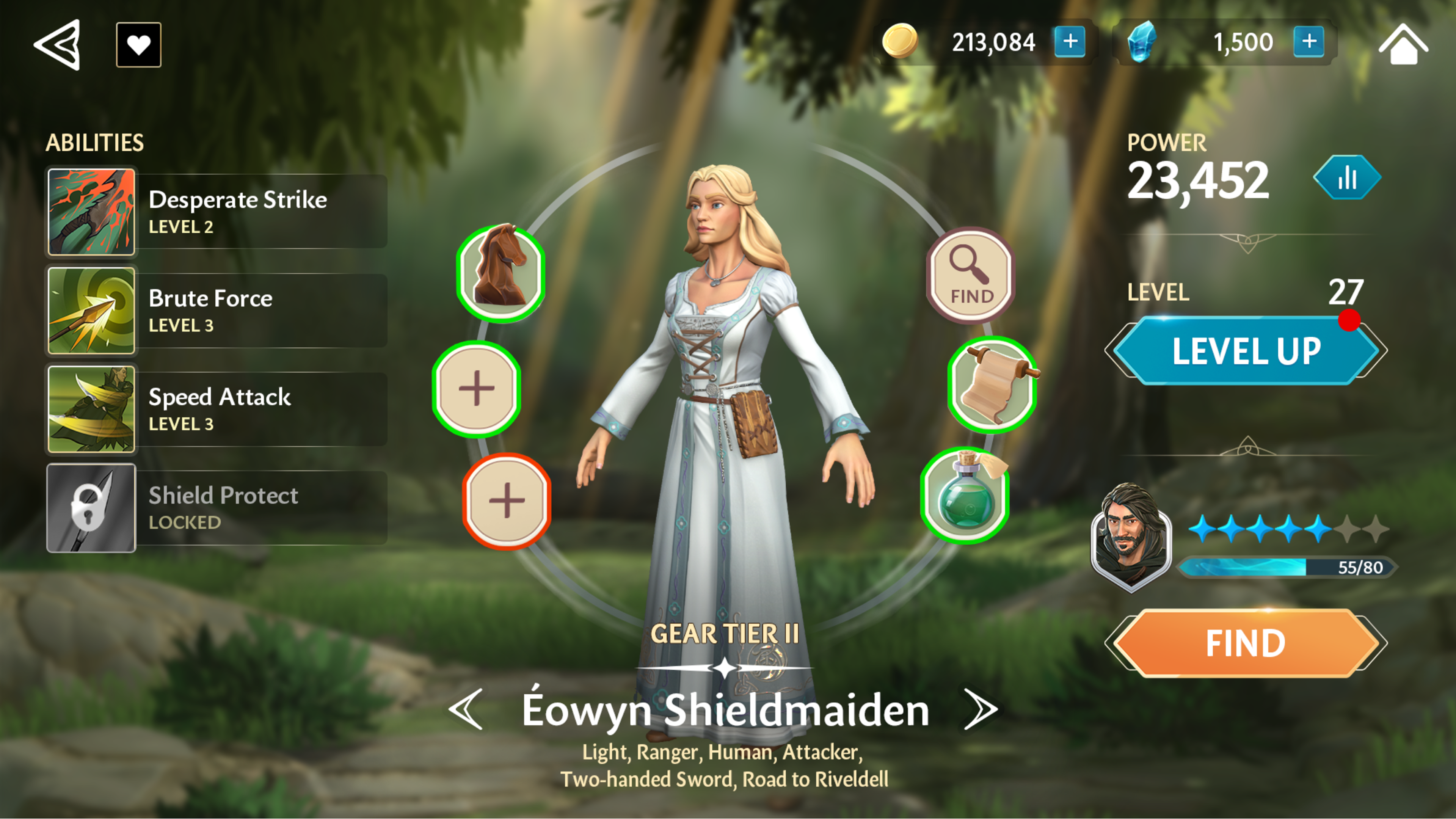 Before — Original UI · No upgrade path