Always a Reason
to Come Back
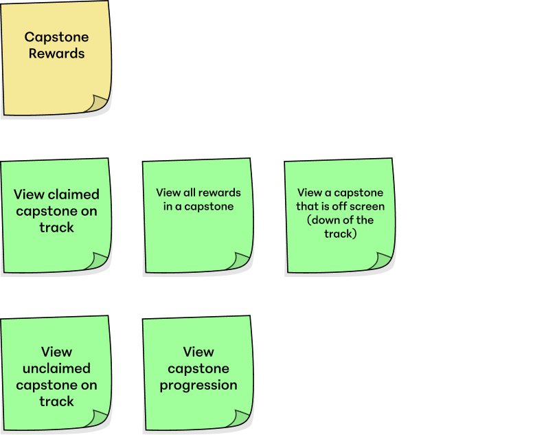
Role
Lead UX — Episode Pass
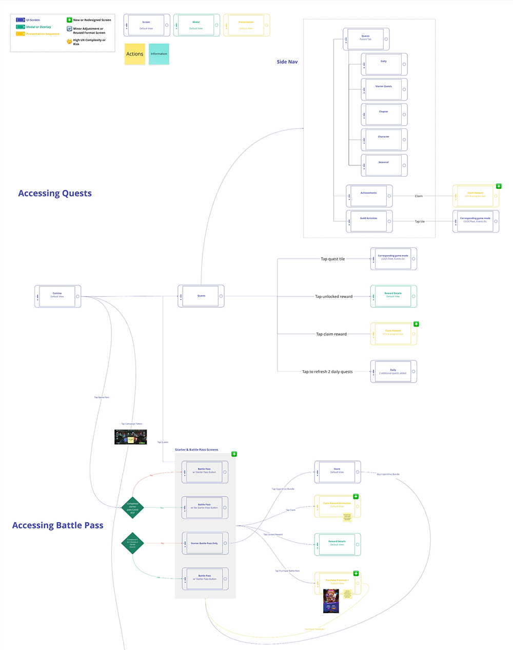
Owned progression logic, reward track structure, purchase screens, and cross-system integration. PC and mobile.
Responsibilities
Problem definition
Audience analysis
Player verbs
Player paths
Information architecture
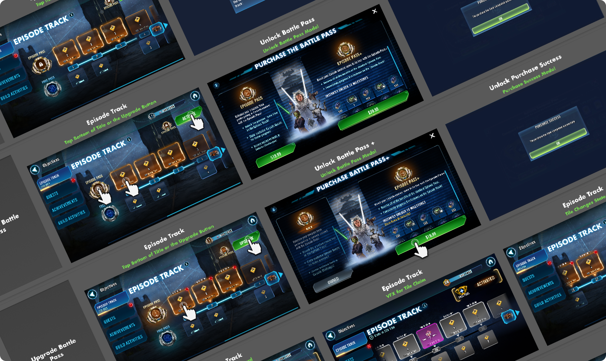
Wireframes
Cross-system design
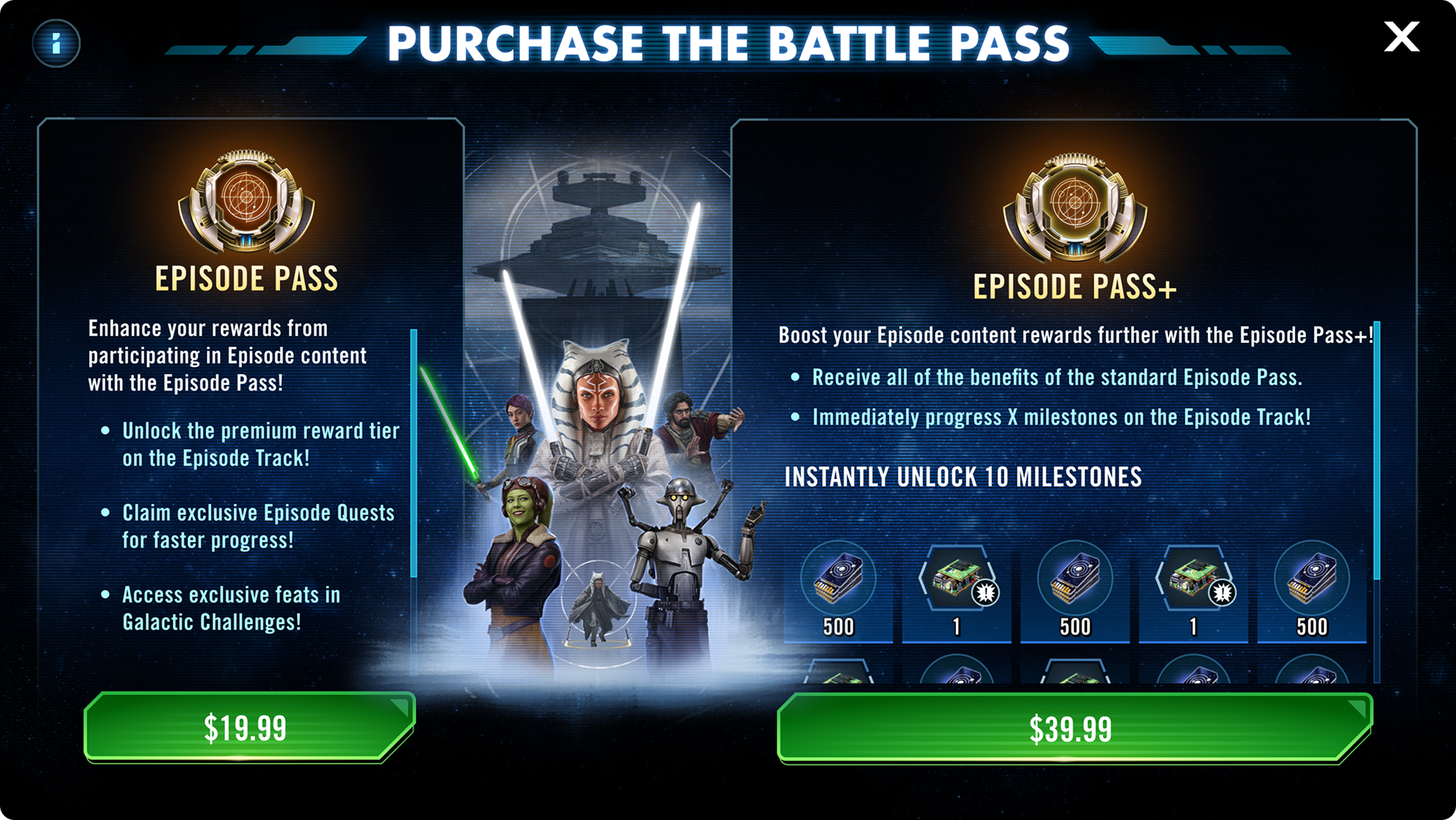
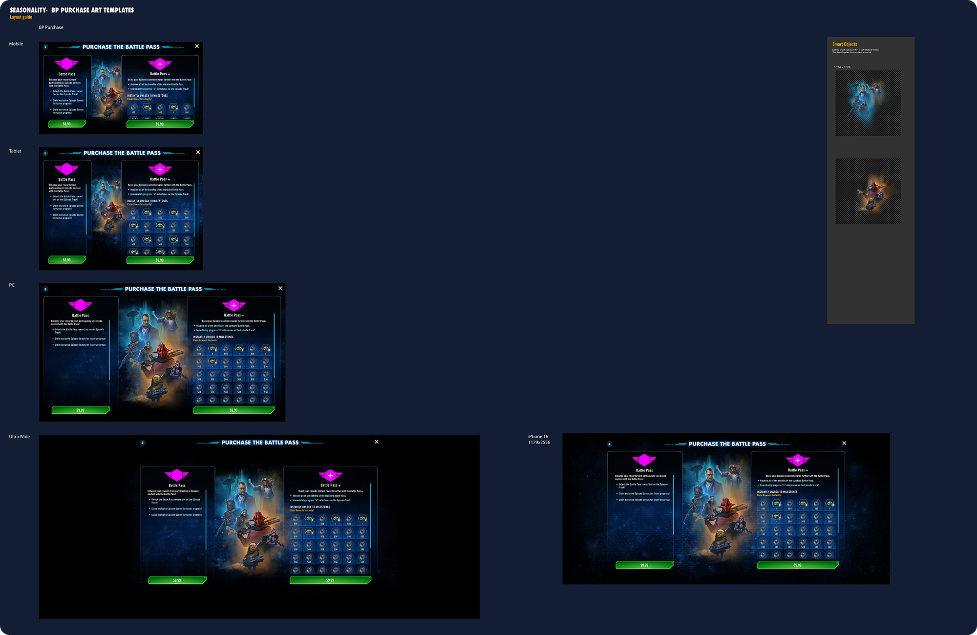
Purchase screen design
Design system contribution
Team
4 Eng · 1 GD · 1 PM · 2 Art · 1 Dir · 1 Audio
Date
December 2024
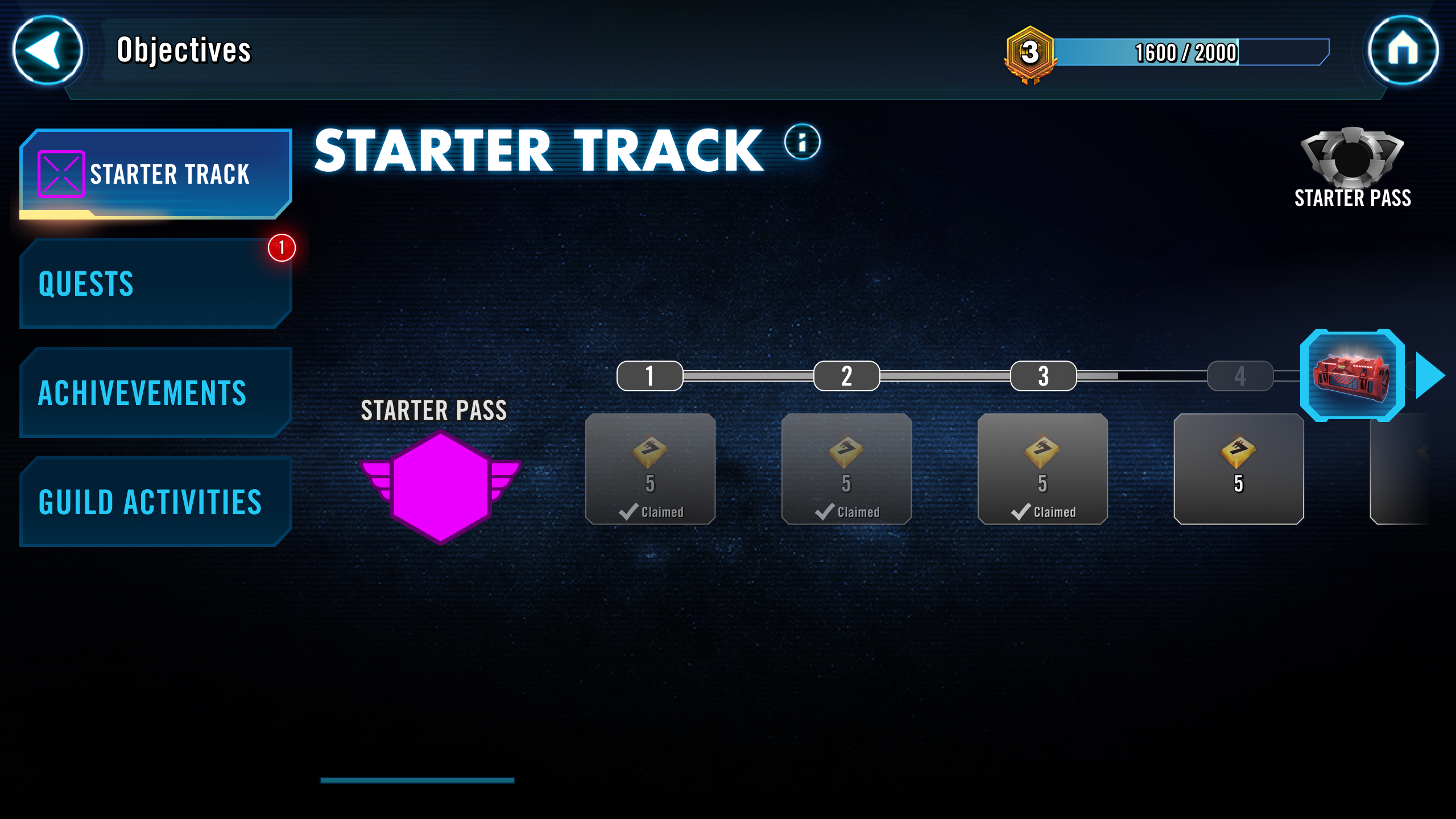
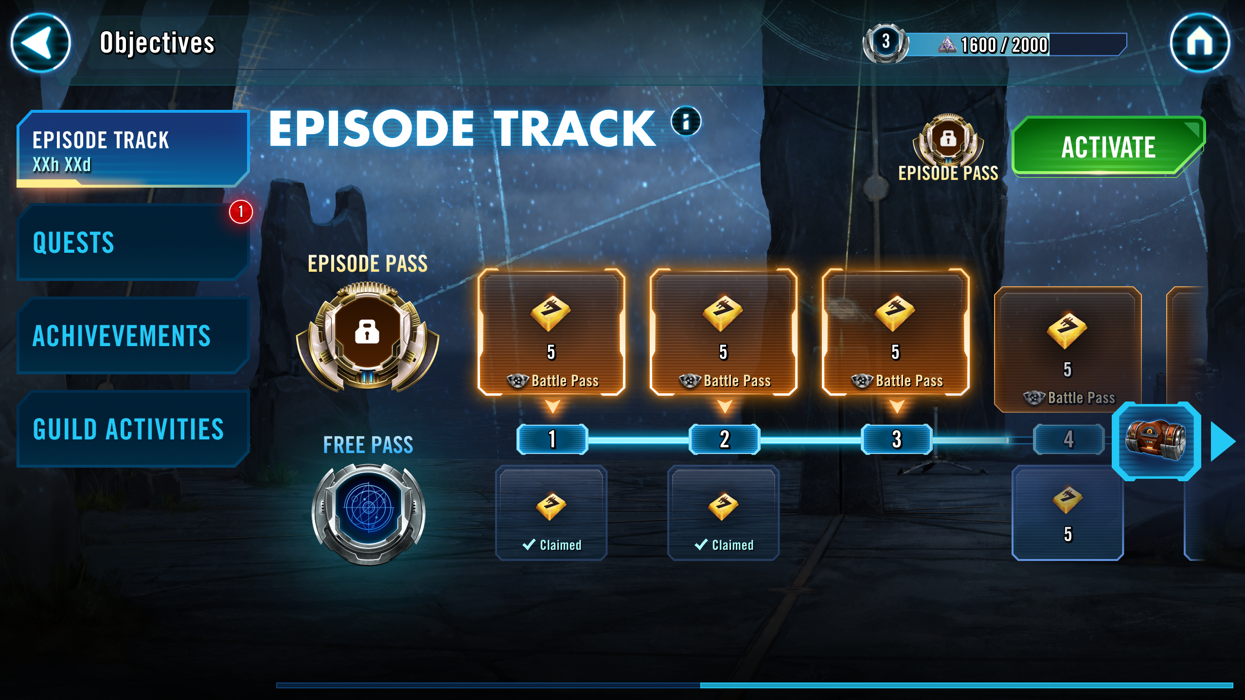
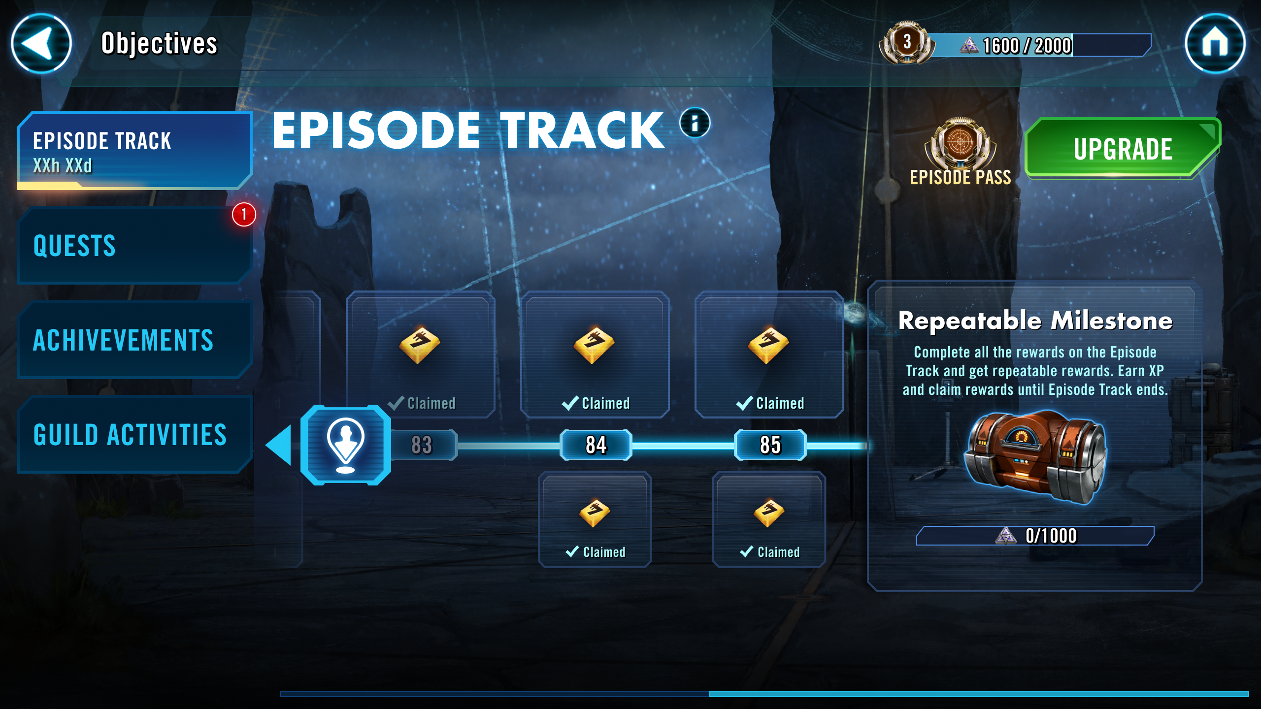
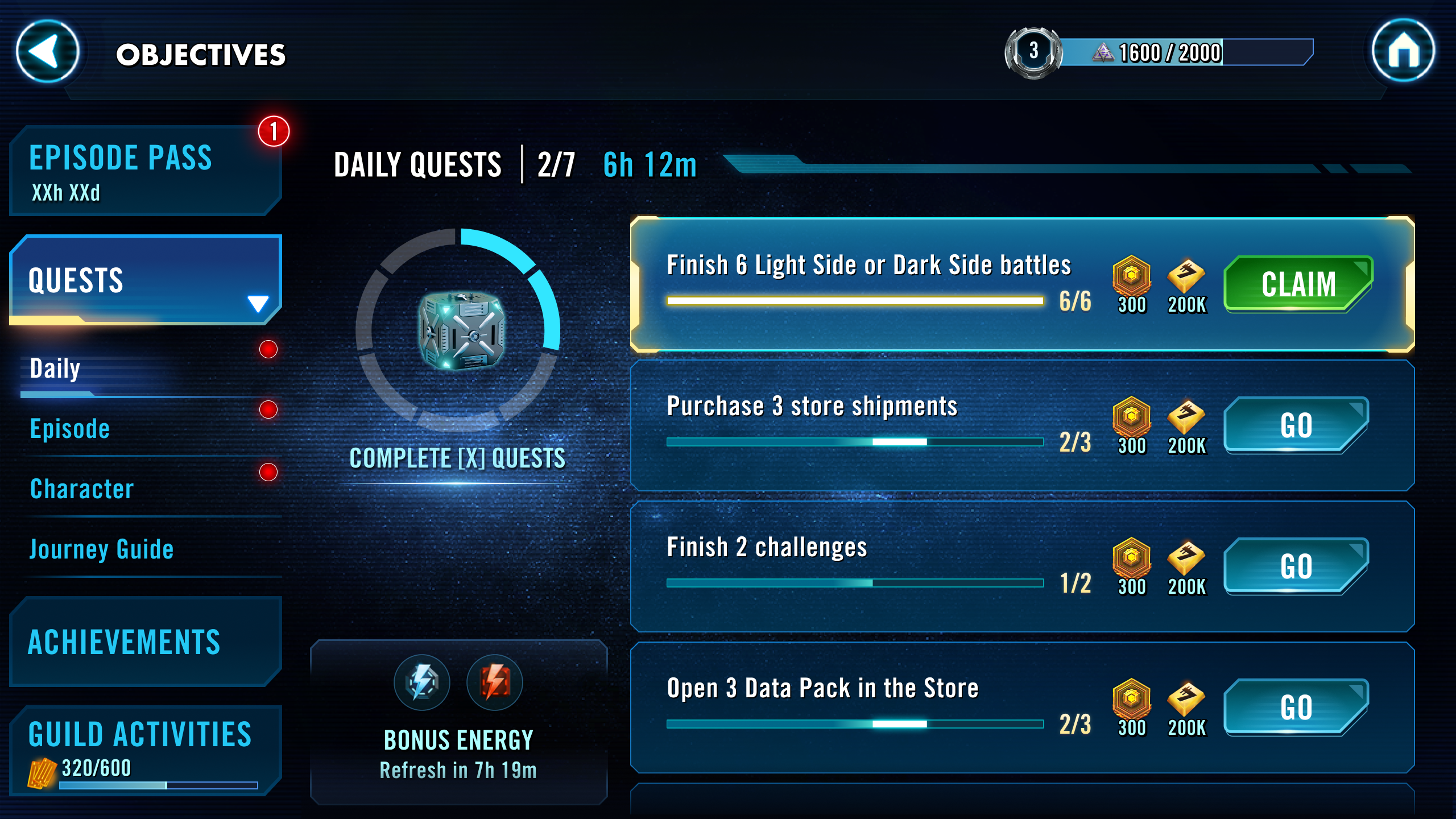
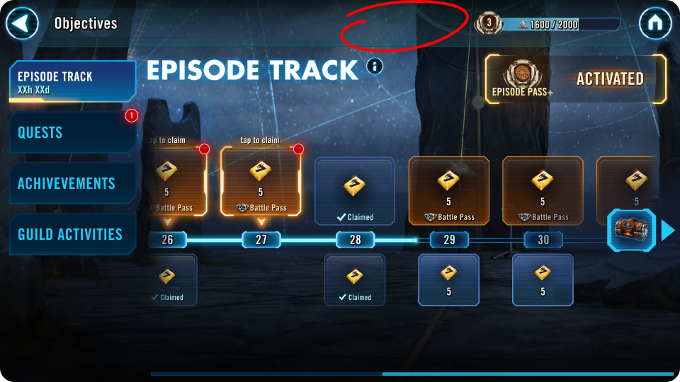
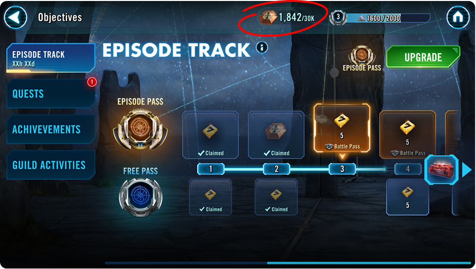
The Problem
Engagement without investment.
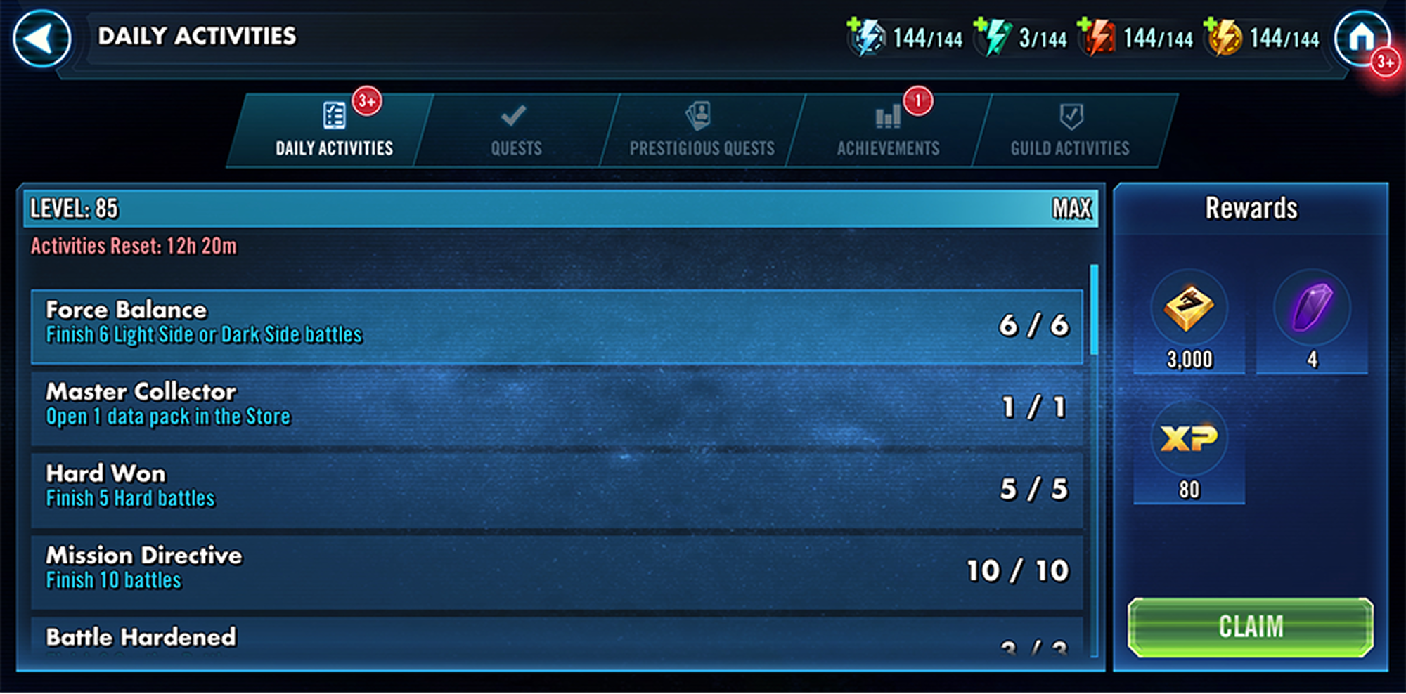
Galaxy of Heroes had daily activities, quests, and confusing tasks that had been running for years. Each one lived on its own isolated screen with no cohesive system connecting them. Players had no seasonal rhythm to follow. There was nothing that made one month feel different from the next. And no reason to invest.
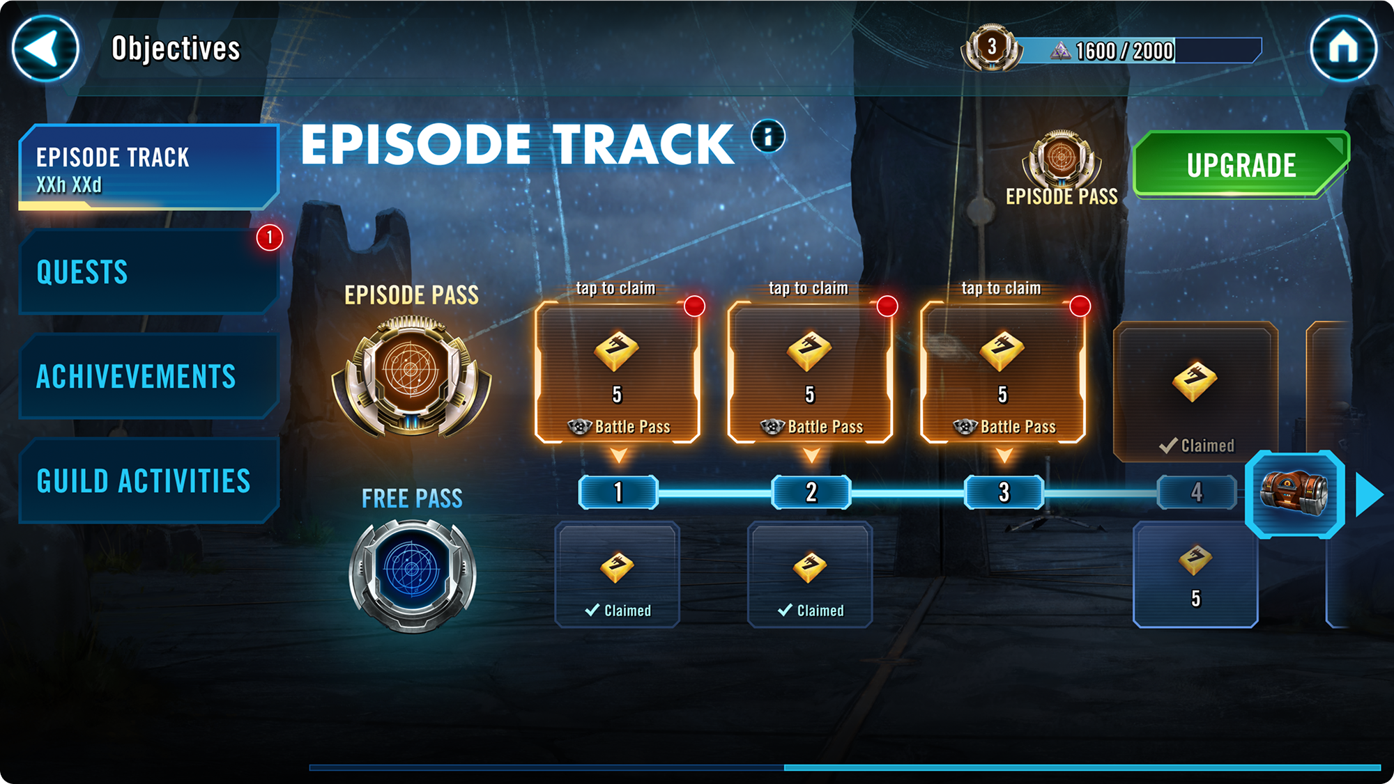
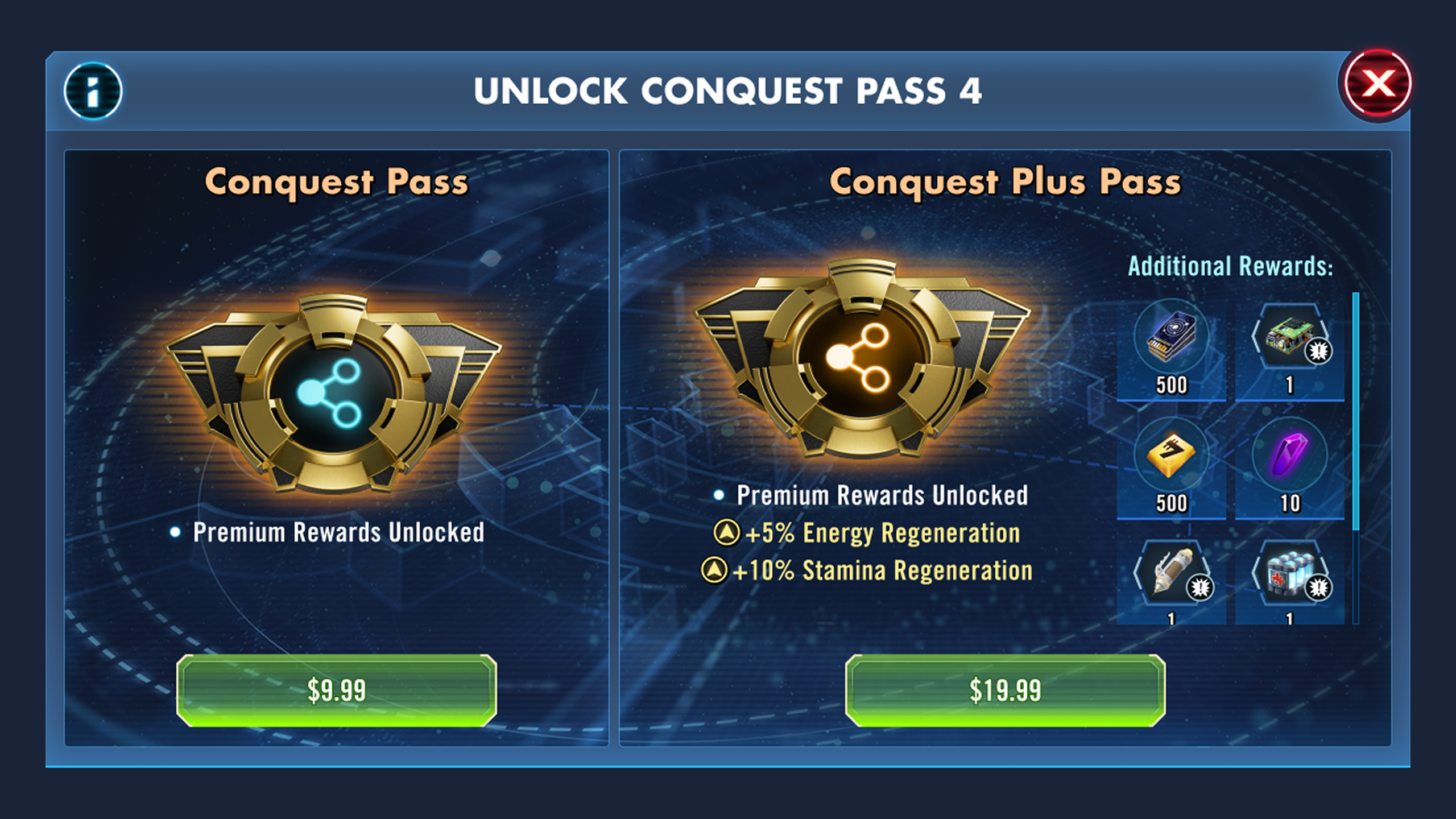
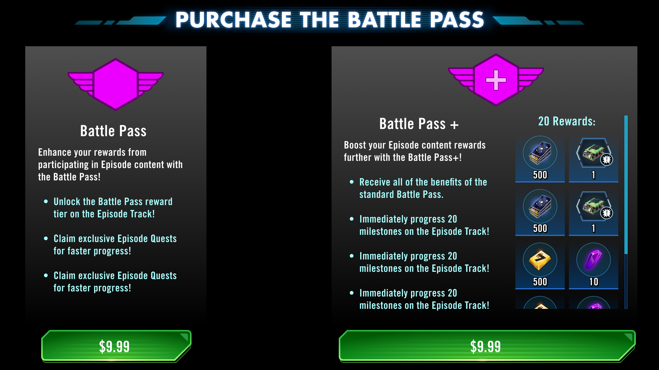
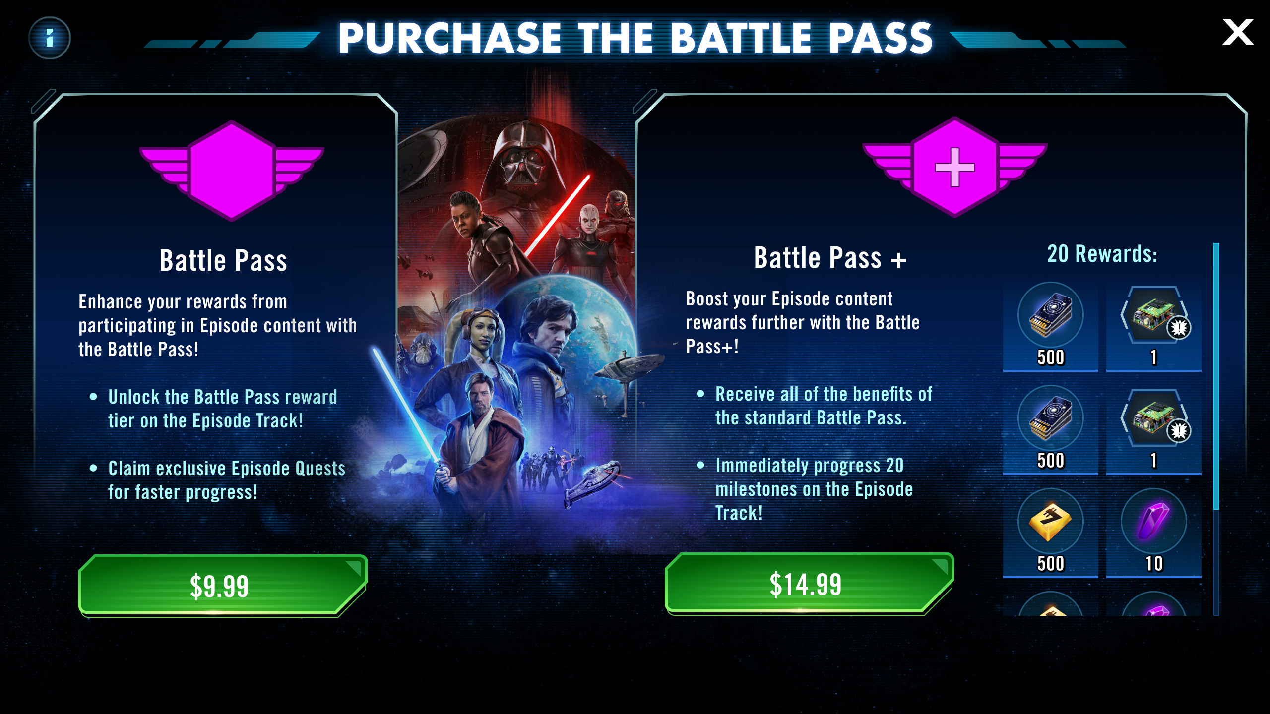
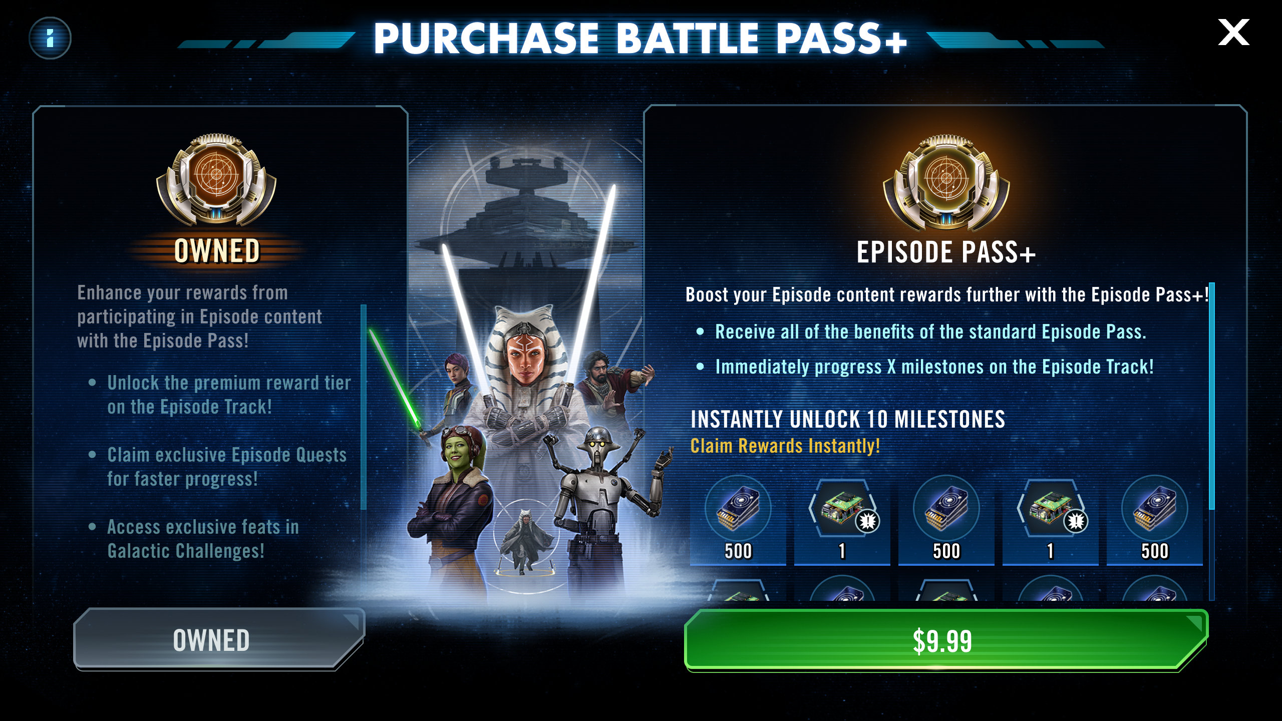
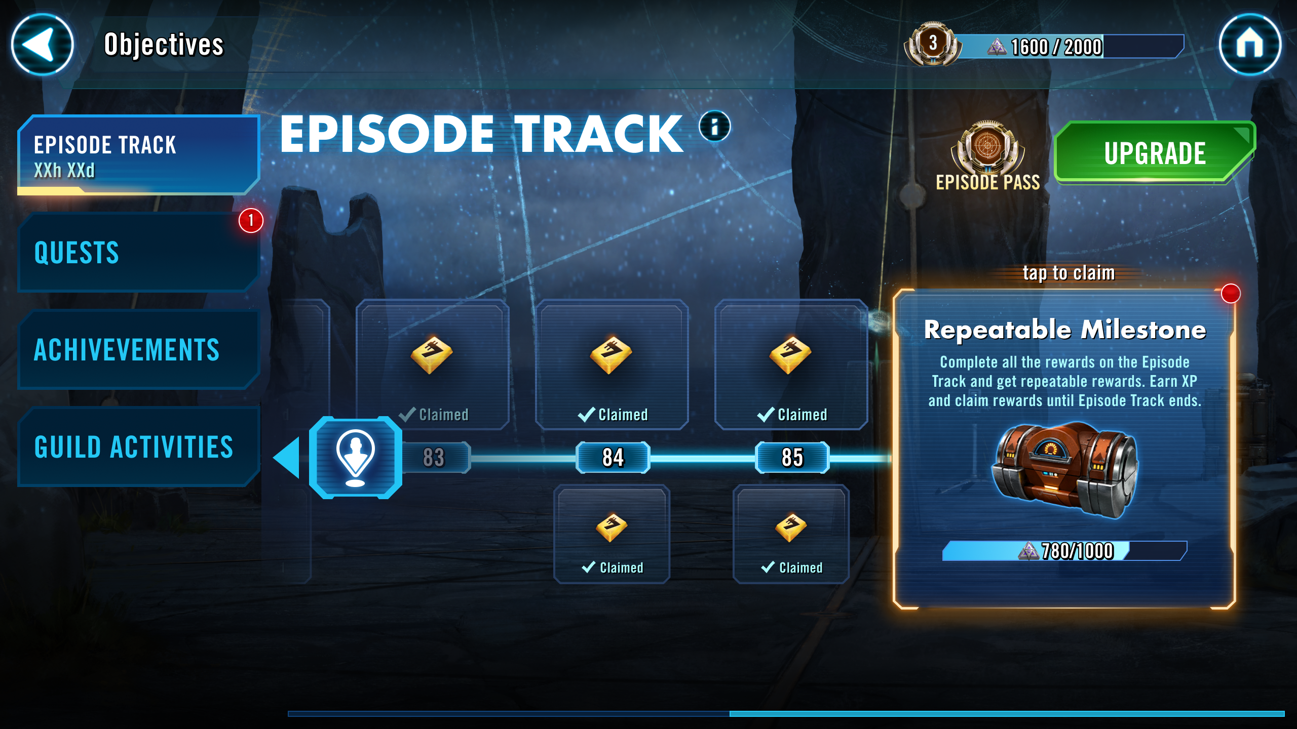
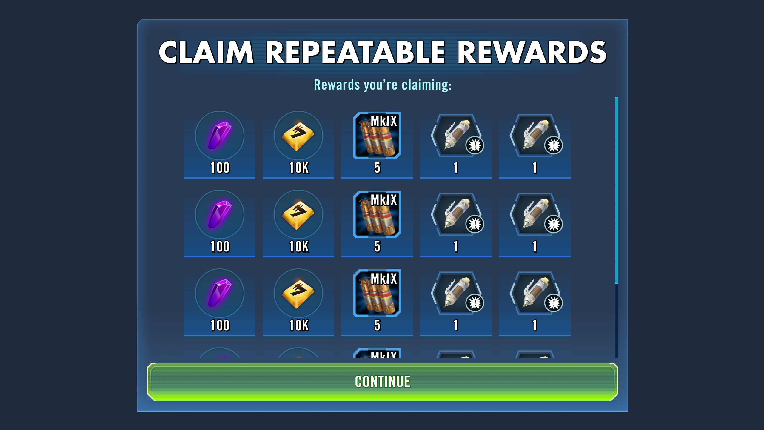
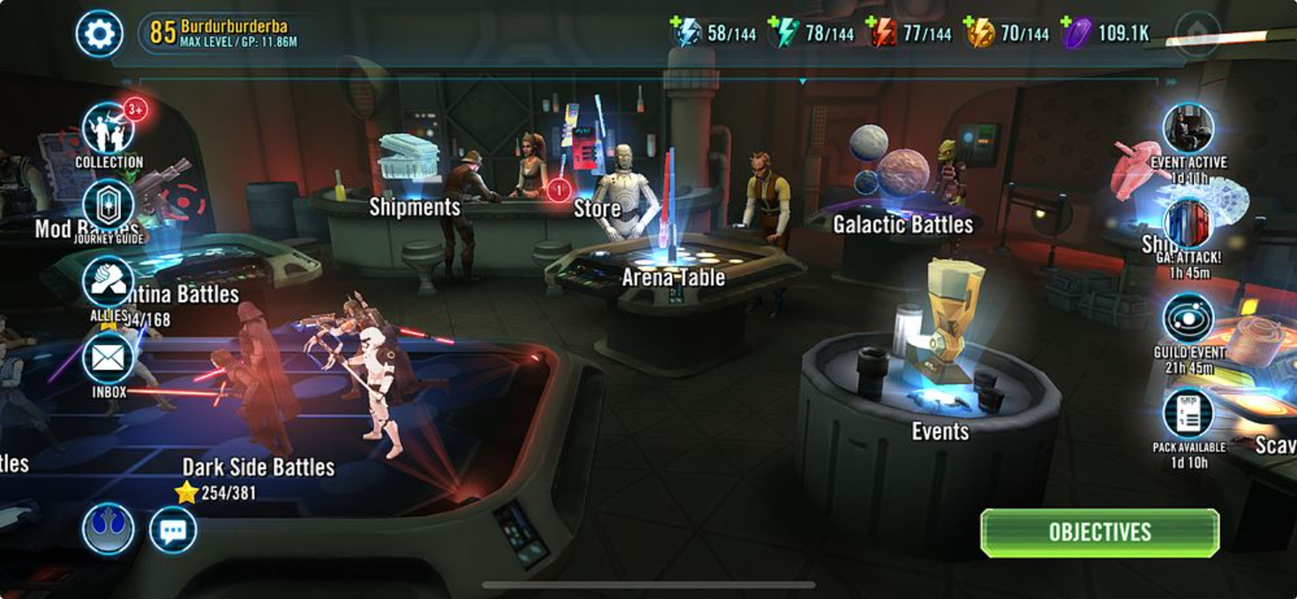
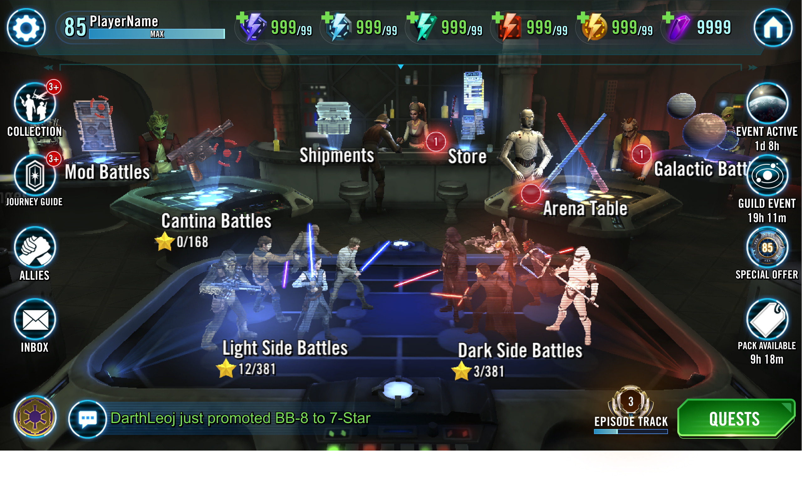
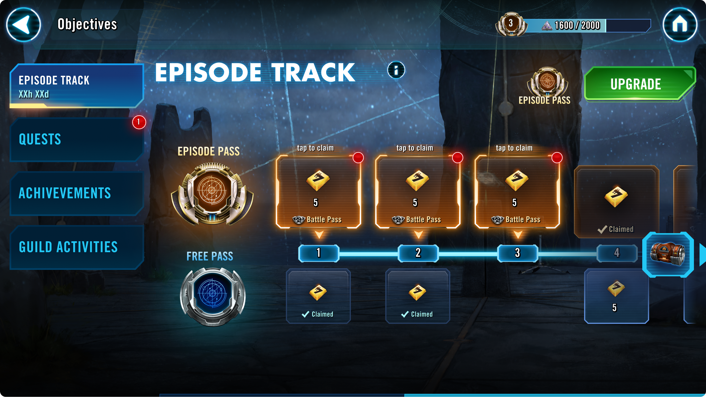
 Before — Original Episode UI