Jason Unck
Star Wars Galaxy of Heroes logo

Keeping Players
Invested

Marquee Event redesign hero screenshot

Role

Lead UX — Marquee Event

Owned the full player experience, identifying where the system was losing players and redesigning the loop to keep them invested. PC and mobile.

Responsibilities

Problem definition

Audience analysis

Player verbs

Player paths

Information architecture

Wireframes

Prototype

Team

4 Eng · 1 GD · 1 PM · 2 Art · 1 Dir · 1 Audio

Date

Jun – Oct 2024

The Problem

Motivation was highest at exactly the moment the system sent players away.

The original Marquee event system was a frustrating and cumbersome experience. Rewards and requirements lived on separate tabs. No character representation and upgrading a character required leaving the event and coming back. That was the exact moment motivation was highest. Players were dropping off after progressing their characters to three stars and didn't return.

Original Marquee UI — before redesignBefore — Original Marquee UI

My Decisions

Decisions that
close the loop.

Information Hierarchy

If it's below the fold, it doesn't exist. Players were making decisions without the information they needed. I moved everything passively afforded to the top so players could see it without looking for it.

Rewards above and below the fold
inverted triangle diagram

Player Verbs. Player Paths.

After understanding the problem and the target audience, I define player verbs. These are the specific actions players can take within the feature. For Display and Statefulness, that meant mapping every way a player could interact with a tier: viewing it locked, viewing it available, claiming rewards, hitting a purchase limit, being gated by an upgrade requirement. Those verbs become player paths. Player paths show how those actions connect and sequence. That’s where edge cases surface. How should a completed tier look when rewards don’t refresh? Are requirements discoverable if they sit below the fold? Working through those questions before any screens existed kept the logic clean and prevented the kind of dead ends players had been running into.

Tier display and statefulness research
Player verbs
Player paths wireframe
Player paths

Closed Loop

Before

Before — exit required to upgrade
Marquee EventSelect SquadBattleCompleteClaimLeave screen to upgradeCome Back

Pre-redesign

Players had to leave the flow to buy bundles

Players were falling off after upgrading characters to three stars

After

After — in-event upgrade
Marquee Event
Select Squad
NewPurchase Bundle
Battle
Complete
Claim

Post-redesign

Buying bundles no longer sends players away from the event

Players push past three stars without losing their place

Two paths. One loop.

Adding the character to the event UI changed what players understood about the experience. Before, players sometimes didn't realize they were upgrading a character at all.

These wireframes show two paths from the same starting point. In the first, the player has enough to promote. They tap Promote, go to the Paper Doll, and come back. In the second, they need more shards. They tap View Offers, go to the store, buy bundles, and come back. Both paths return to the event without breaking the loop.

Character hero — after state
Promote
Paper doll — before state
Paper Doll
Marquee event day one state
View Offers
Day 2 offers state
Store Bundles

Familiar system. New job.

The Journey Guide was an existing system with a layout and interaction model players already knew. Before designing anything, I studied how it worked and where the pattern could be borrowed. The solution didn't require reinventing the structure. It required understanding it well enough to use it in a new context.

Journey Guide — requirements below the fold
Requirements list — Journey Guide
Requirements list — enlarged view
Requirements list — enlarged

Seven tiers. Two shortcuts.

Players needed to move through up to seven tiers. Scrolling works. But scrolling alone means players lose context the further they go. I wireframed two navigation patterns to solve for both. The first shows a player scrolling through tier cards naturally by touch or mouse wheel. The second shows a player tapping the persistent side nav to jump directly to any tier. Seeing them both together validated my intuition. Two inputs. One connected system.

Scroll only navigation
Tap to scroll
Scroll navigation
Scroll
Tab side nav
Tab side nav
Cards scroll
Cards scroll

The Craft Moment

Designed fast.
Built right.

25min

The system grew
with the feature.

Right after a sync meeting, engineers needed the card layout and side navigation locked to start scaffolding. Rapid wireframes, multiple variations, presented and locked in 25 minutes.

I contributed to the Galaxy of Heroes design system by building custom UI components and patterns specifically for the Marquee redesign. When the feature shipped, those components became part of the broader system.

Rapid wireframe layouts
Shippable UI design

Validating before code.

Full working Figma prototype. Presented at a studio wide meeting. It surfaced edge cases and communicated the final vision to the broader team before anything changed. Logic stayed clean. Handoff stayed tight.

Figma prototype walkthrough — tier states, star cap behavior, and bundle logic

Results

Players invested faster
and went further.

Characters tied to the redesigned Marquee events ranked among the top unlocks within the first week. Players invested earlier and upgraded characters faster, leading to stronger first-week engagement and higher tier completion.

CX-2

Top unlock — First 7 Days

#1CX-28.3% of total unlocks

Top Characters by 5★ Unlock Share

% of total unlocks · First 7 days

CX-2

8.3%

CC-119 'Appo'

7.8%

Temple Guard

6.9%

RC-1262 'Scorch'

6.6%

Disguised Clone Trooper

6.6%
Marquee Event redesigned UI — full tier view
Select Event Squad screen
Victory screen
Tier I complete — Marquee Event
Chromium Data Pack — requirements met screen

Updates

Refining after launch.

After launch, two things stood out. Tier states weren't reading clearly enough at a glance. And players returning to the event couldn't find where they left off. We increased contrast on the tiers and added auto-scroll so players always landed on the next actionable tier.

Tier states before redesign — low contrast, unclear status
Before
Increased Contrast
Tier states after redesign — high contrast, clear status indicators
After
Auto-scroll before — player lands at top of event, completed tiers visible first
Before
Auto-Center on Return
Auto-scroll after — player lands directly on next actionable tier
After

The

OBJECTIVE

PLAYERS

Players needed a smooth path they could understand instantly: jump in, battle, upgrade, and replay without getting lost. The goal was to remove friction, eliminate dead ends, and make upgrades accessible directly inside the event.

BUSINESS

For the business, the objective was just as clear: increase tier completion, improve replay rates, and support the upgrade–purchase loop by surfacing value at the right moments without interrupting flow.

UX

At the UX level, I built a clear loop and a scalable framework for battling, progressing, and upgrading.

The

PROCESS

The goal was to fix clarity and rebuild the Marquee flow so it could support seasonal content. I grounded the redesign in how players actually interacted with the event, focusing on the moments that confused them, slowed them down, and pushed them out of the loop.

I gathered real behavior signals from player comments, a full UX teardown, competitive analysis, and pre-production alignment with PMs, designers, and the economy team. From there, I reframed the experience and partnered with the art team to build a character implementation workflow the team could scale for future events.

Research:

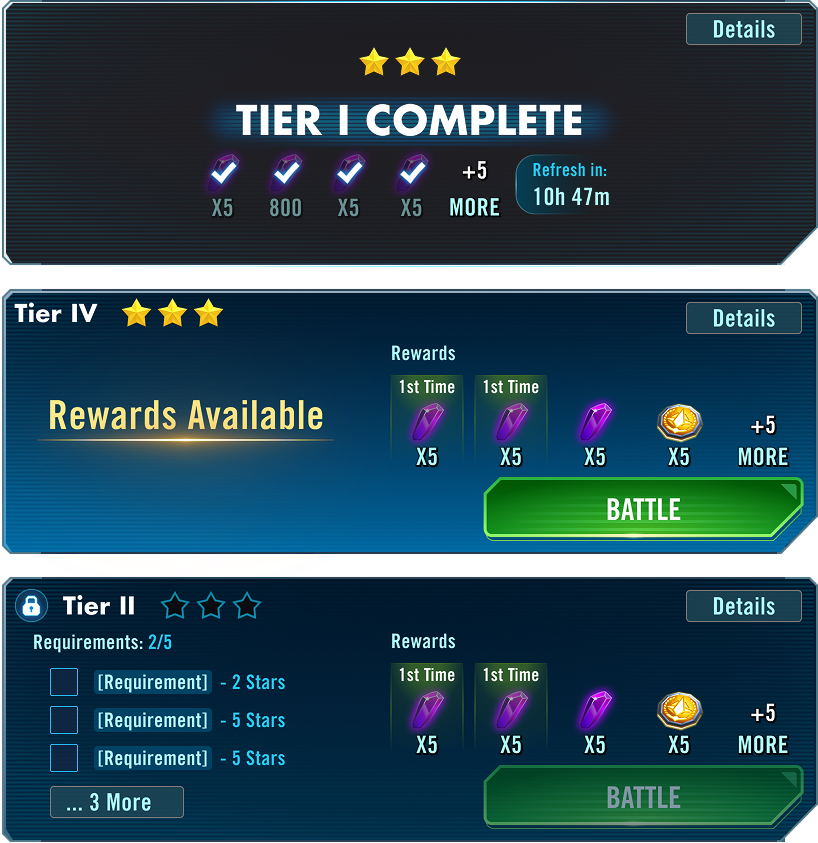
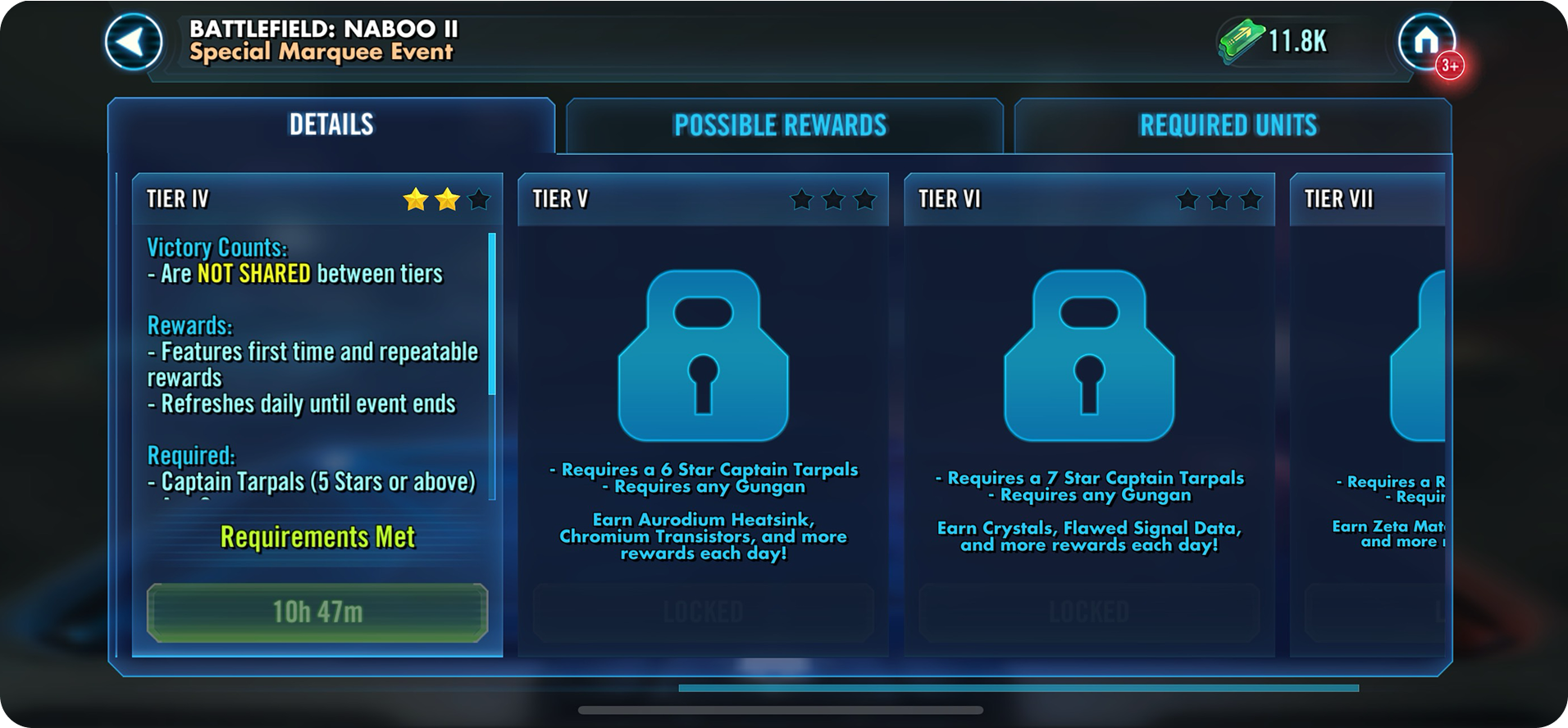
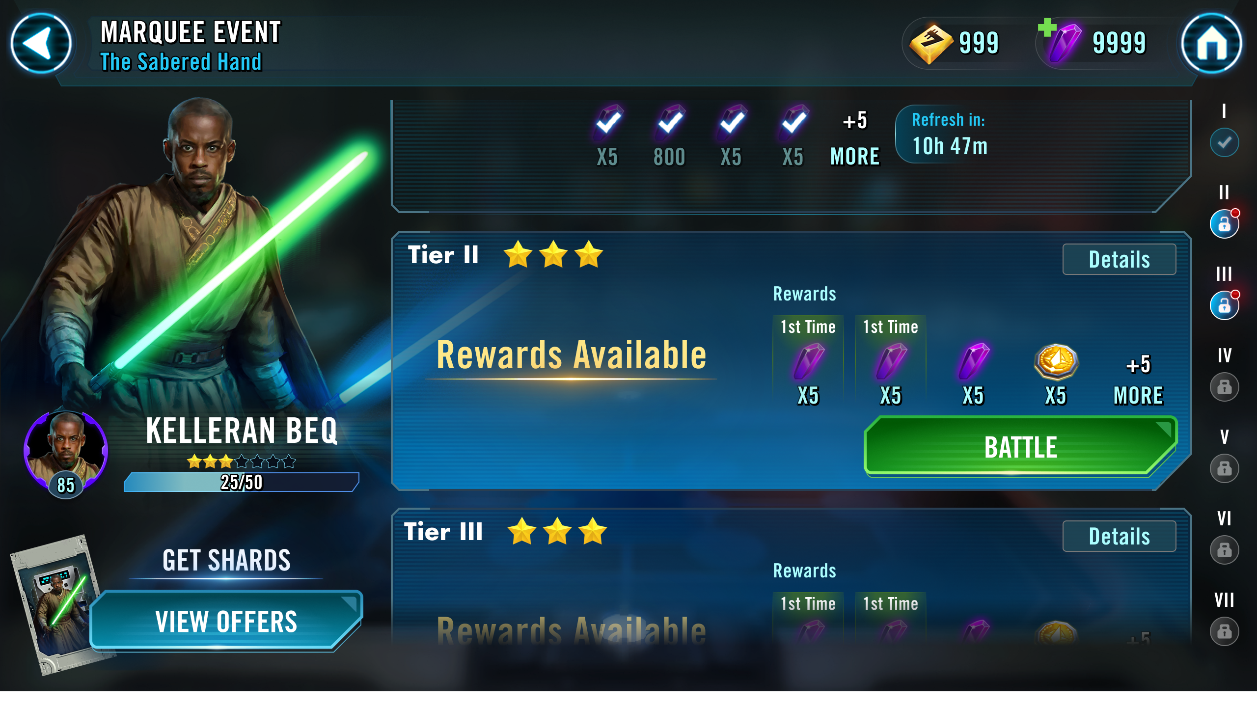
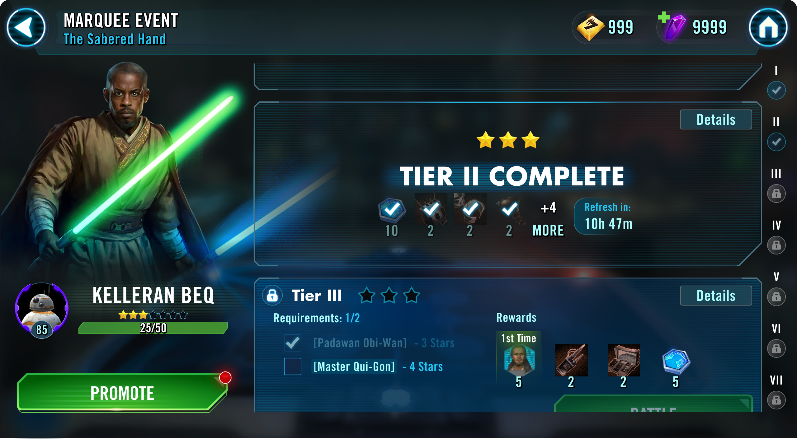
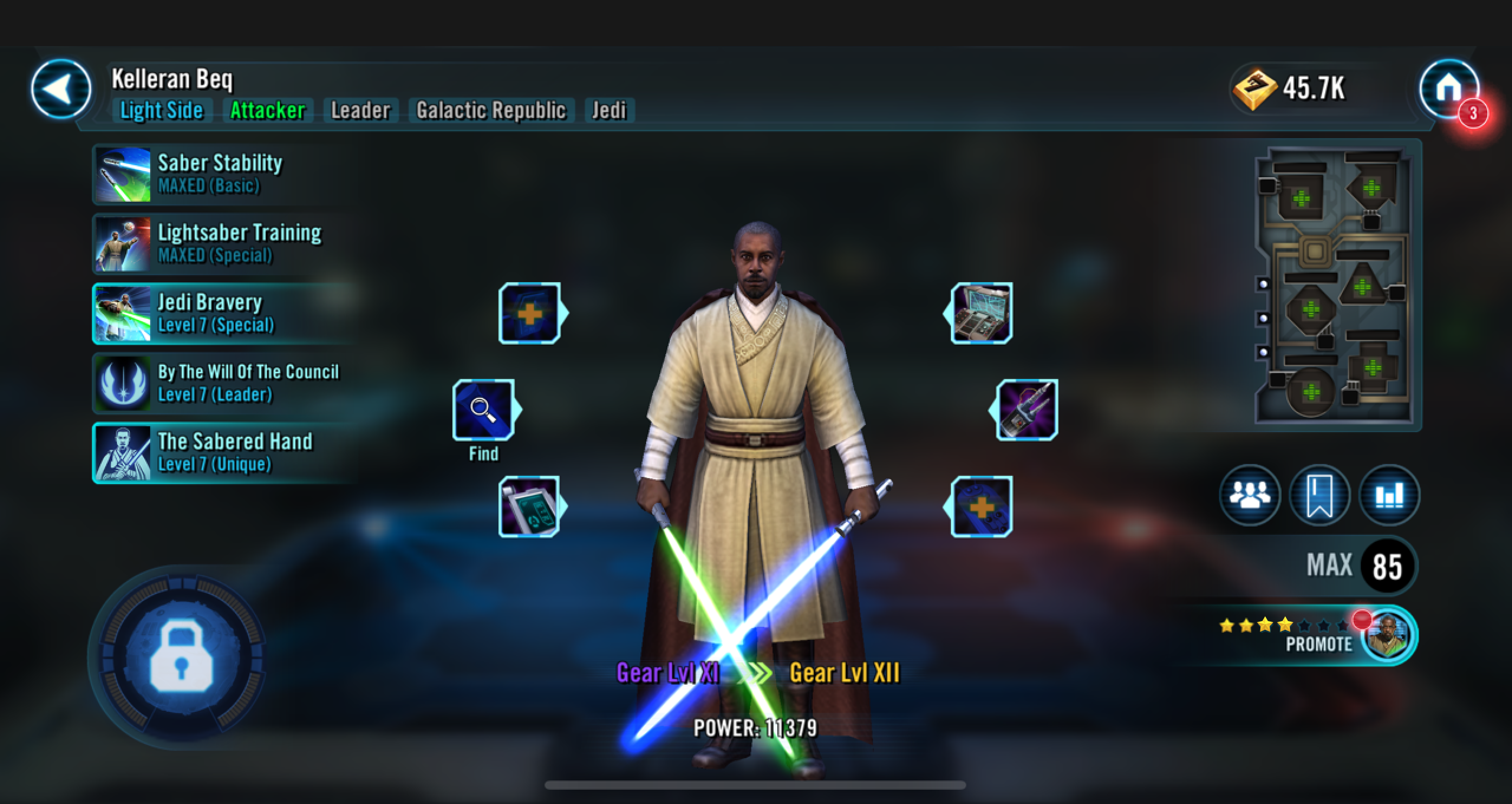
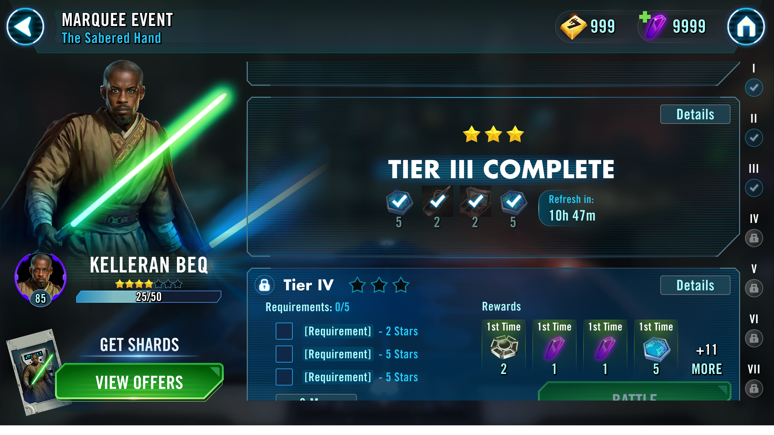
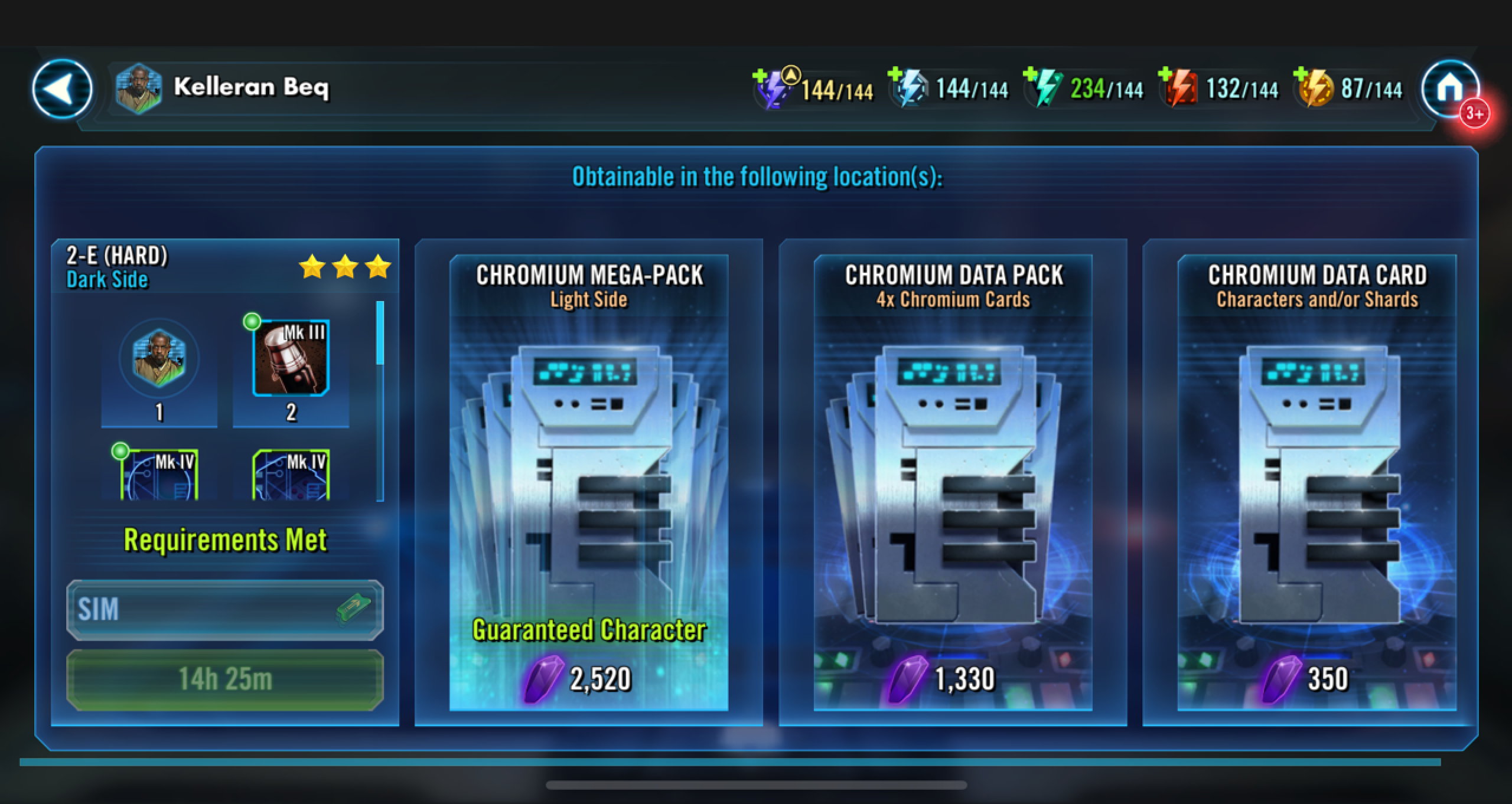
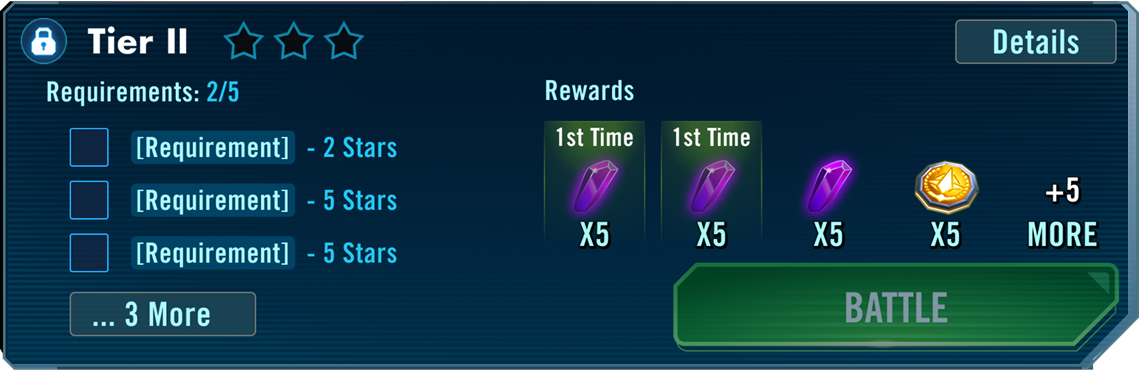
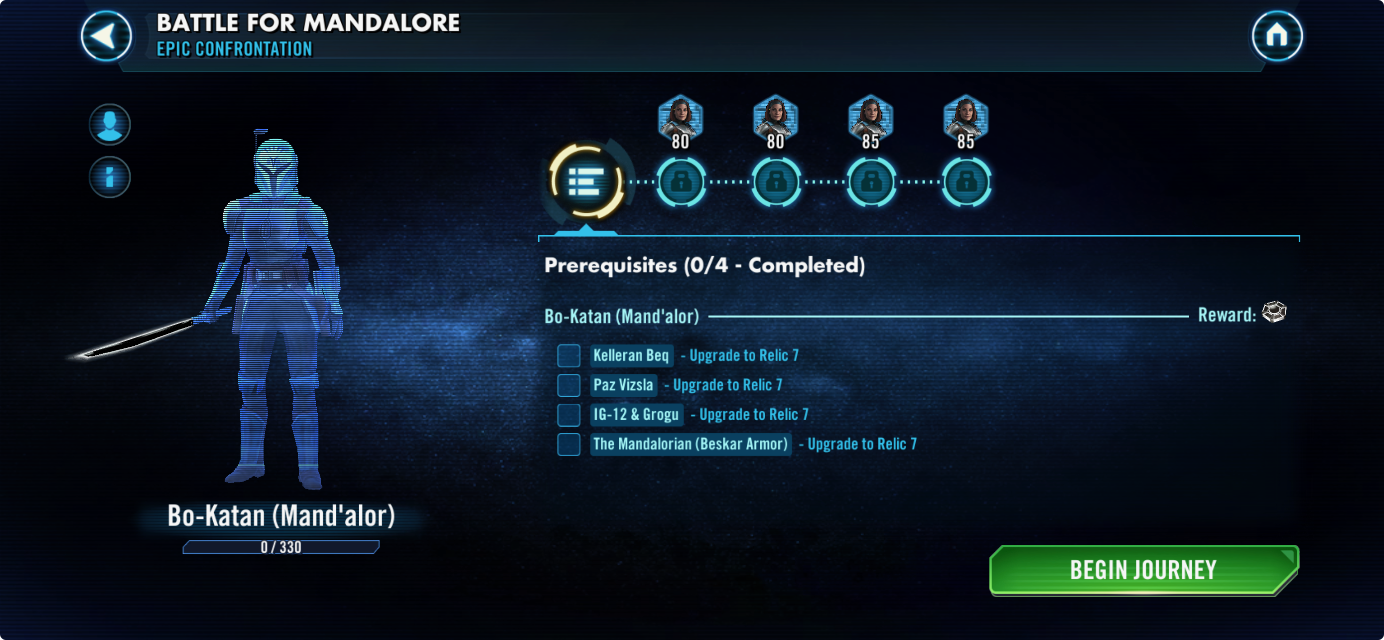
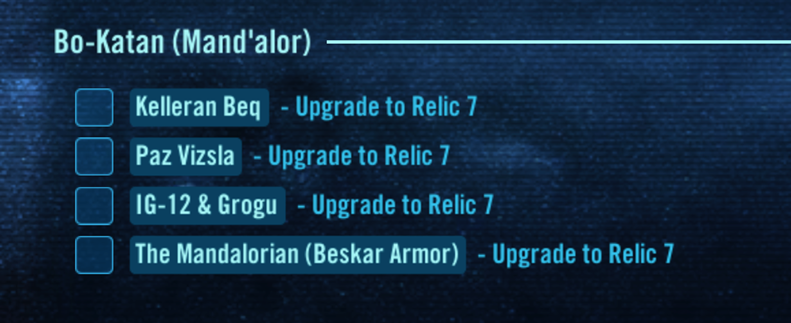
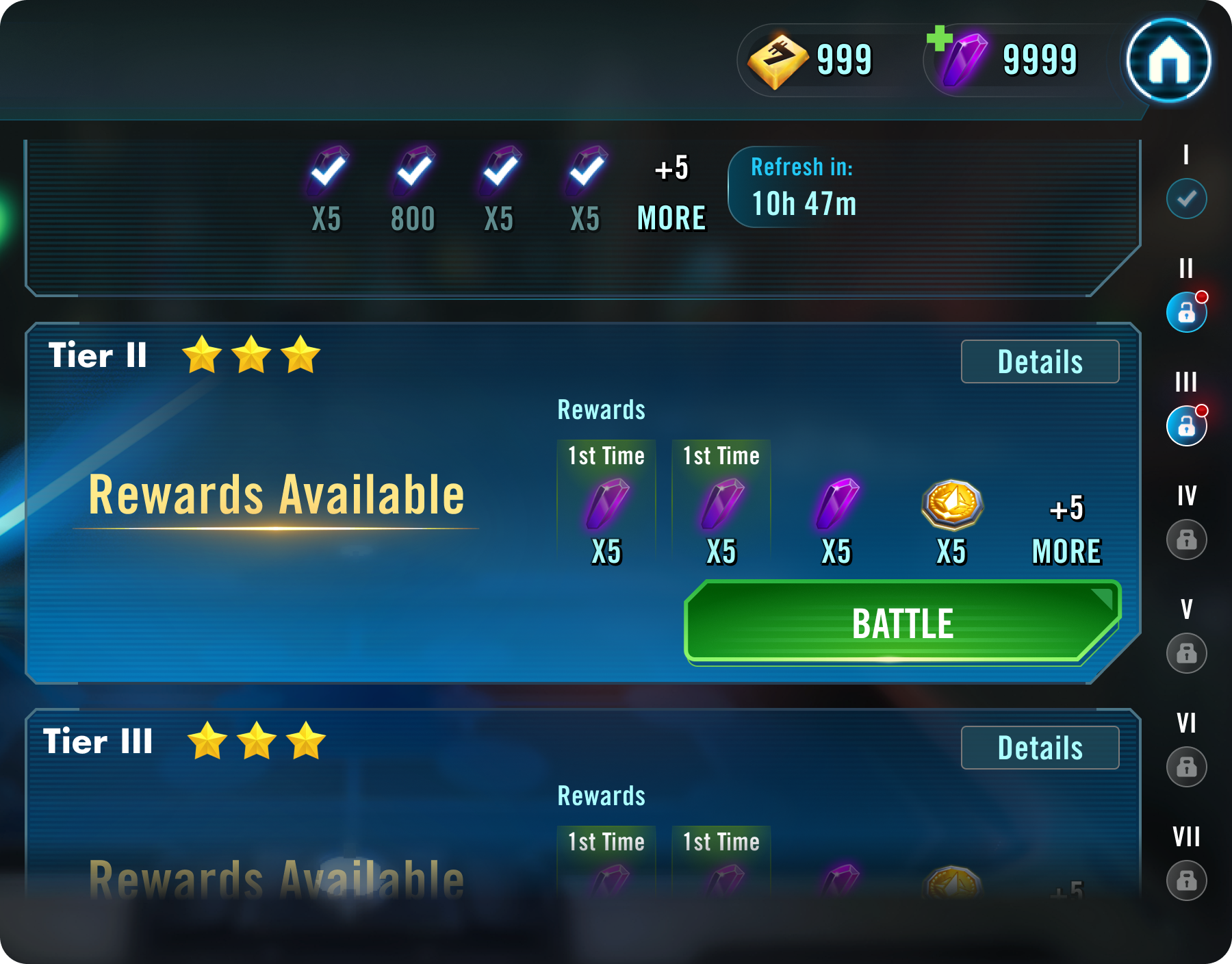
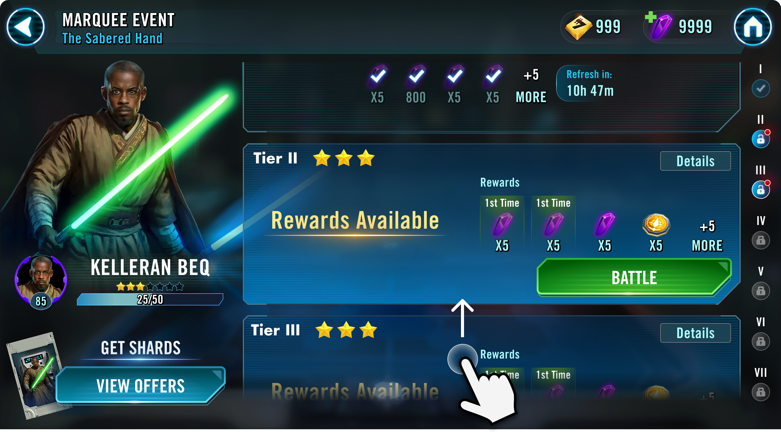
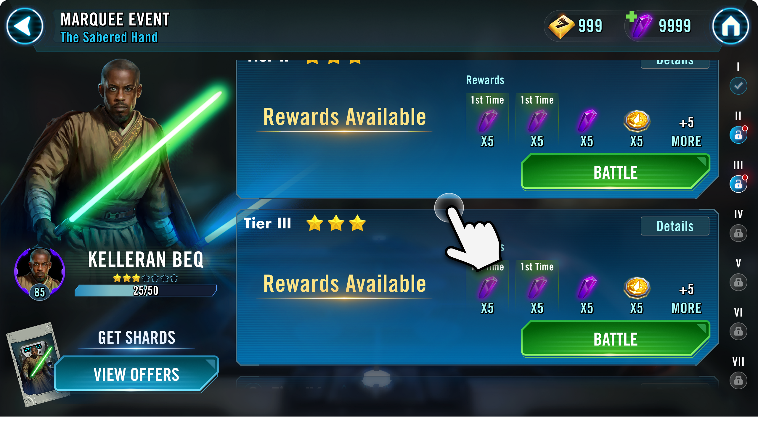
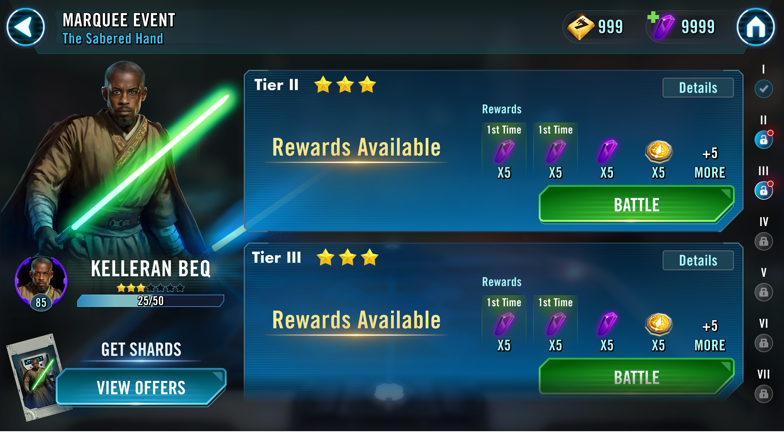
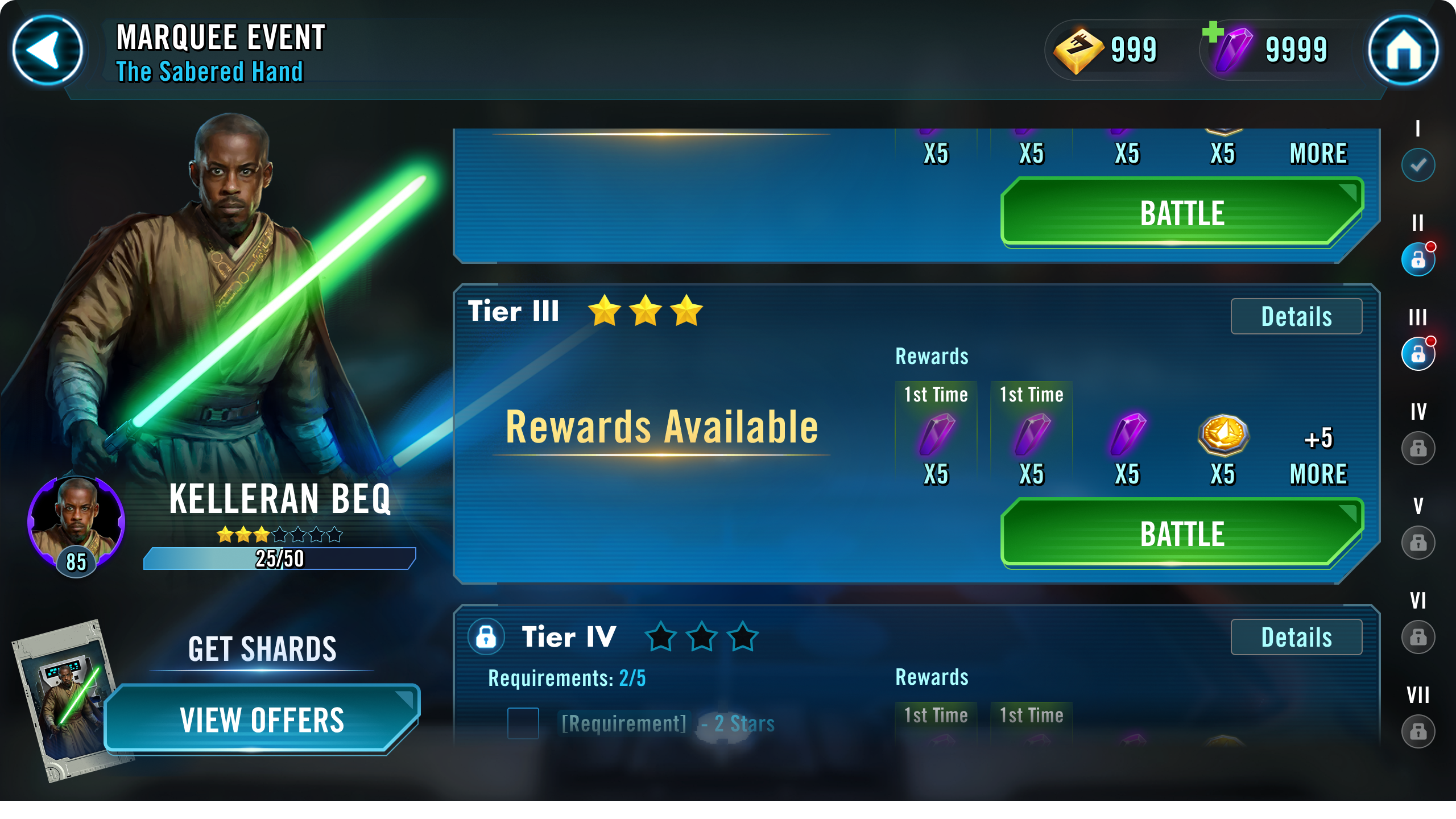
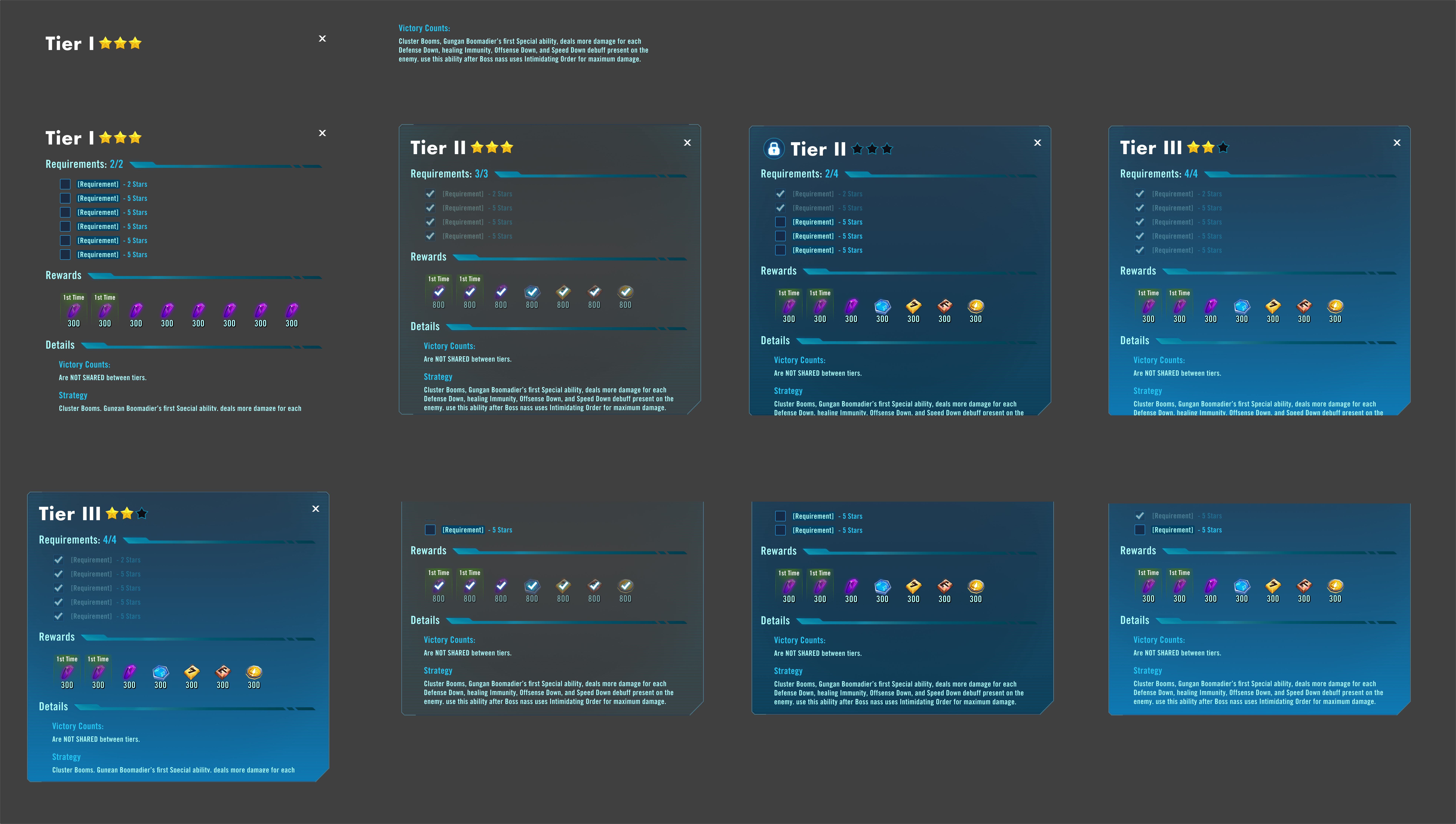
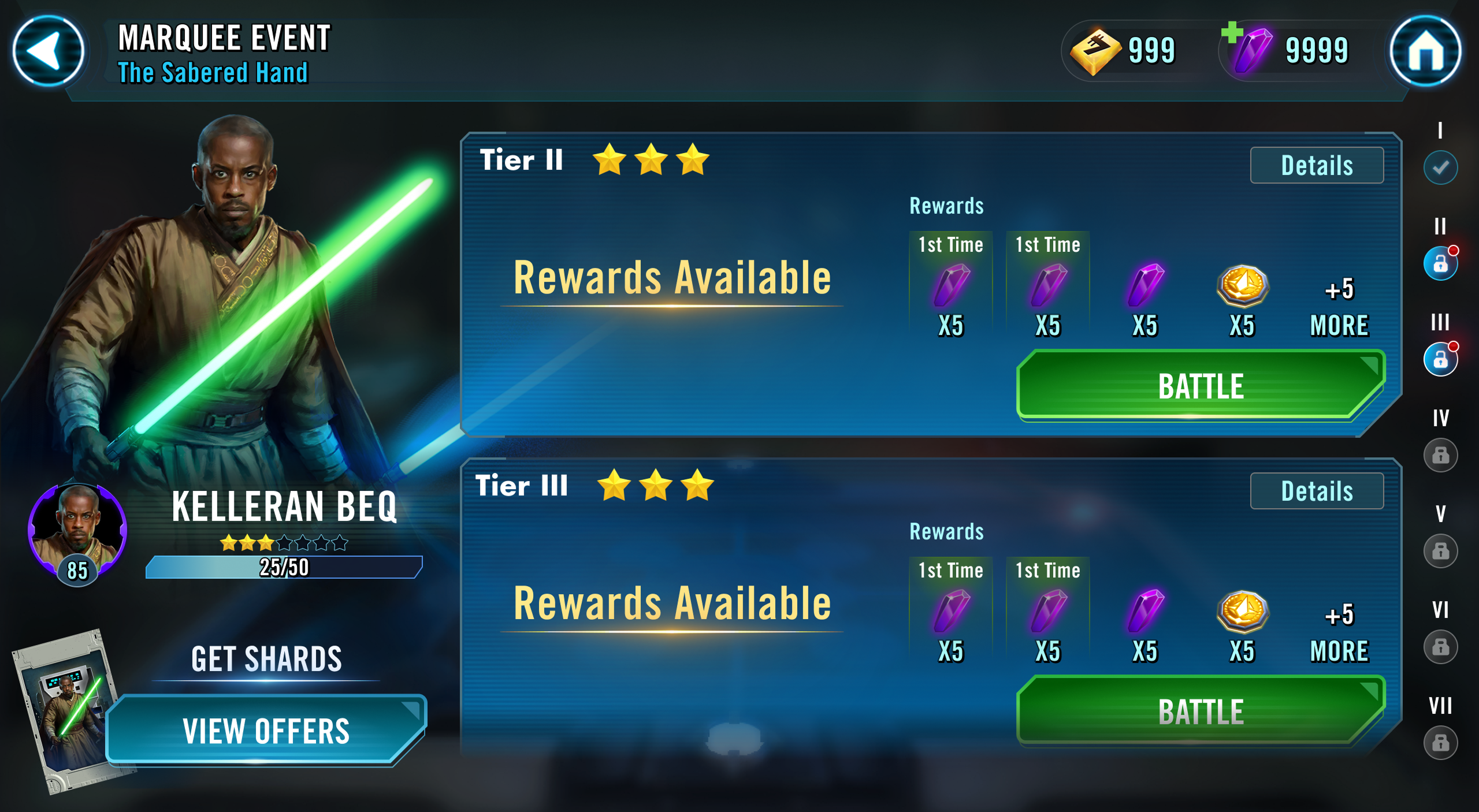
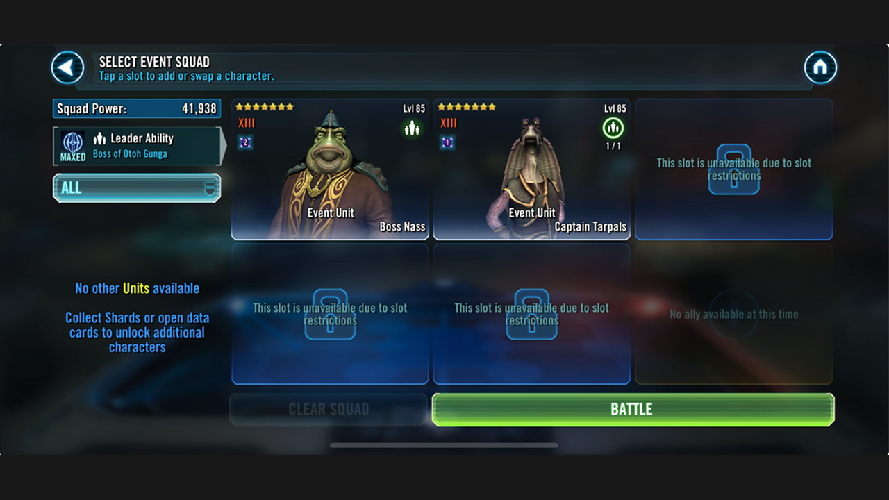
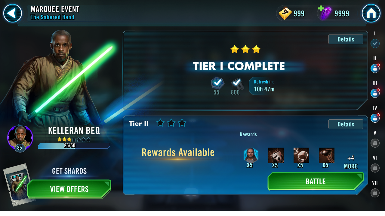
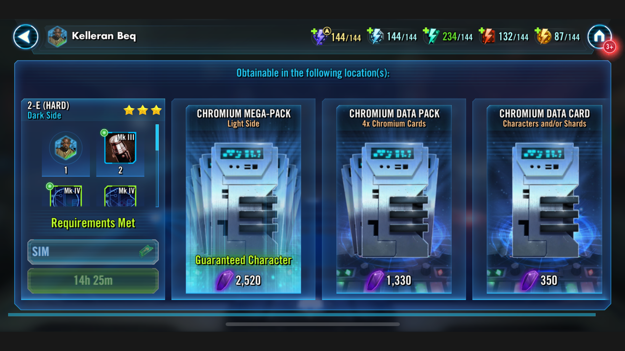
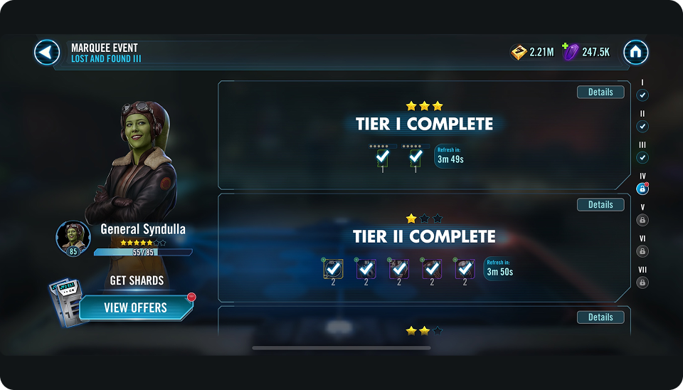
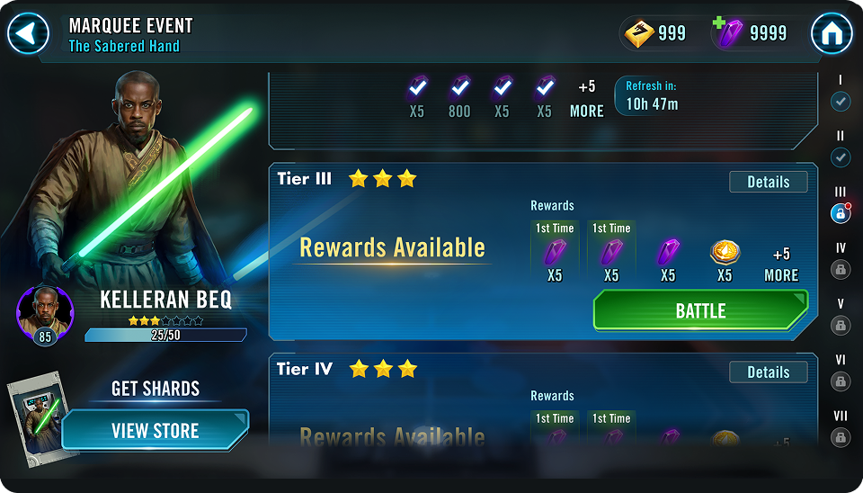
Our research combined player feedback, UX teardown, and competitive analysis to pinpoint where the event was breaking down. Four issues shaped the redesign. Rewards and requirements were buried on another screen, and tier states were difficult to understand, which made progress unclear. The event UI also offered no representation of the required character and made upgrading or promoting cumbersome. Finally, players could not access the store from the event UI, which interrupted the loop at the moment they were most motivated to act.

Audience:

Casual players needed more direction, core players wanted predictable value, and lapsed players needed a simple way back into the loop. The redesign put clarity first, surfacing value early and giving every player a clear, reliable next step.

Define:

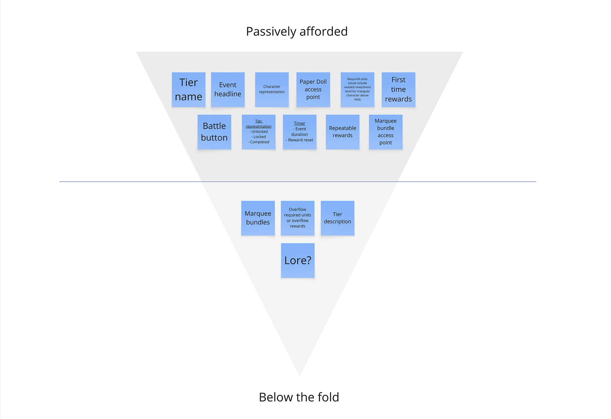
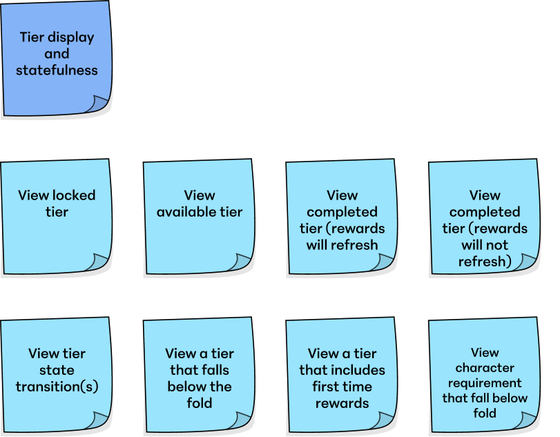
In pre-production, I mapped the core actions players take during a Marquee event using the same systematic process I apply to all feature work. For this redesign, two actions emerged as the anchors. Character investment drives long-term engagement, and progress tracking helps players understand where they are and what unlocks next. These became the foundation for the Marquee UI.

Player Actions

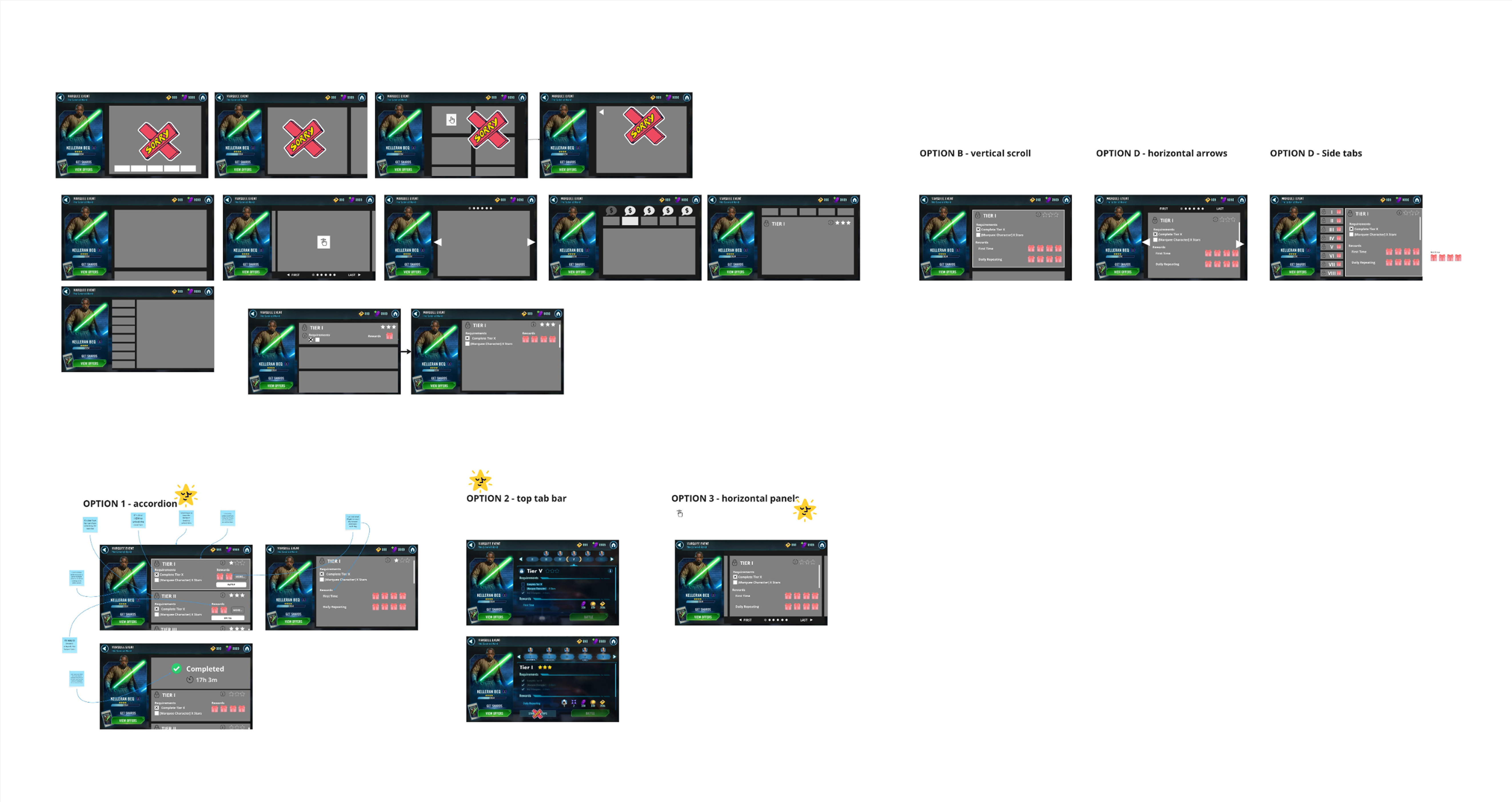
The sticky diagrams show examples of how I break actions into clear, interactive states. They visualize player intent, state changes, and the feedback needed at each step. This framework defines the logic before any screens are built, ensuring the UI reflects how players actually think and move through the experience.

Marquee Clarity Workshop — Player Paths diagram
Marquee Clarity Workshop — Information Architecture diagram
Flow storyboard strip 1Flow storyboard strip 2Flow storyboard strip 3Flow storyboard strip 4Flow storyboard strip 5

The

SOLUTION

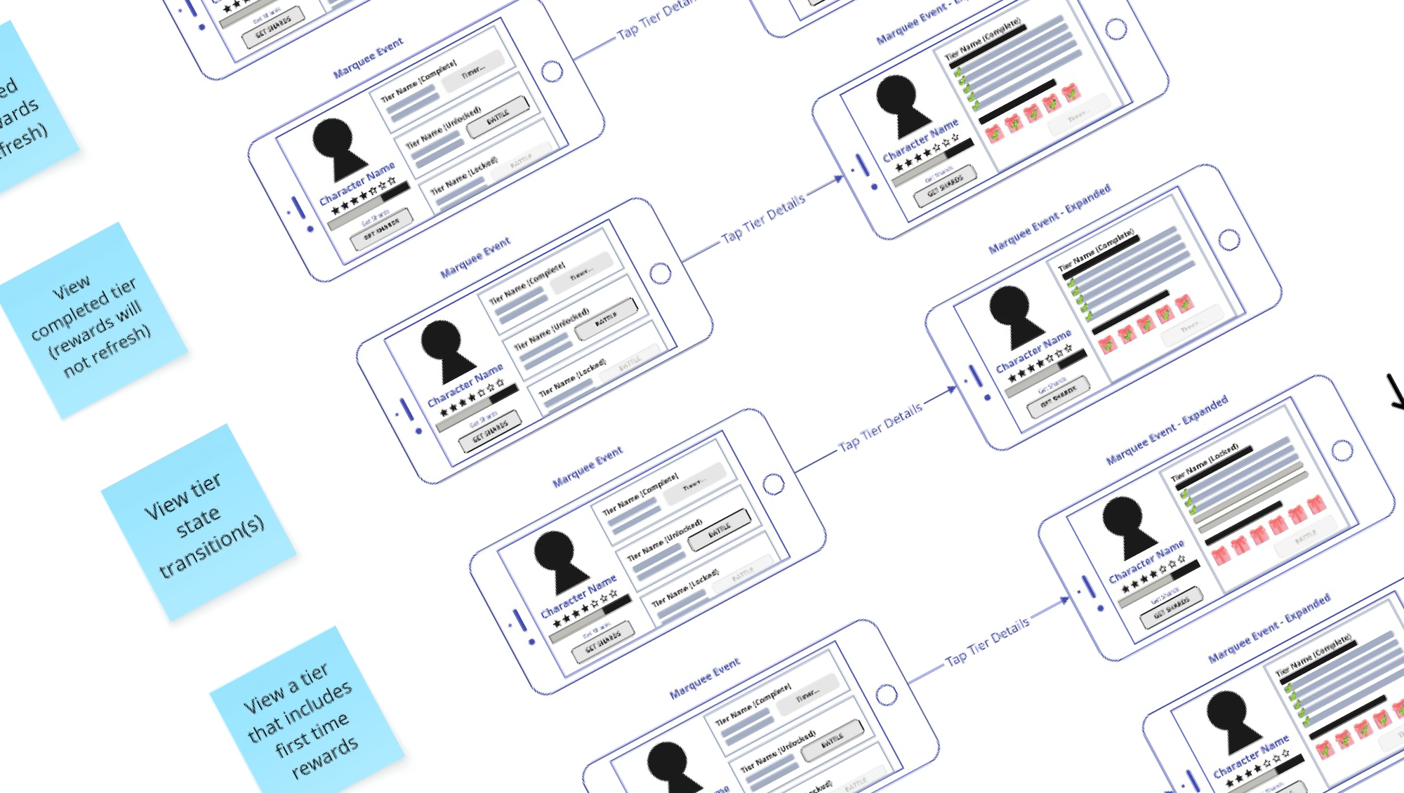
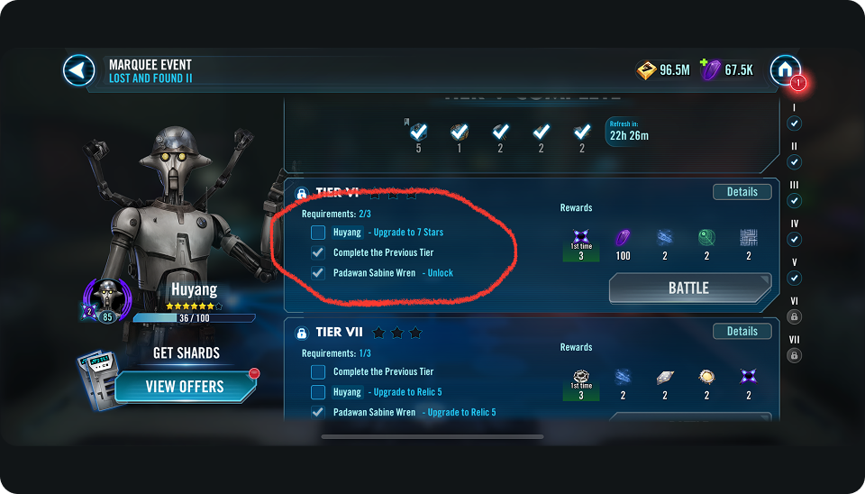
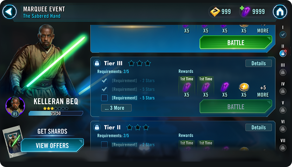
I rebuilt Marquee as a single, cohesive flow where players never lose context. Character representation sits directly in the event UI, supported by clearly labeled, high-contrast UI elements that make progress and requirements obvious at a glance. Unlocking, upgrading, and promoting all happen in one place with immediate feedback. Rewards surface early, tier states are unmistakable, and store access is integrated into the loop so players can buy packs and bundles at the moment they are most motivated.

The result is a streamlined system that replaces confusion with momentum and guides players through the event with confidence.

Top Characters by 5 Stars + Unlock Share (First 7 Days)

896543210
% of Total Unlocks

CX-2

CC-119 'Appo'

Temple Guard

RC-1262 'Scroch'

Disguised Clone Trooper

The

TAKEAWAY

This project reinforced that clarity is a growth lever. When players can see their progress, understand their options, and act without friction, momentum follows. By unifying character investment, progression, and rewards into a single, readable loop, the Marquee Event shifted from a confusing system into a predictable, scalable experience that players trusted and engaged with.

For me, the lesson was clear. Start with player intent, design the system before the screens, and treat clarity as a first-class feature. When the experience is easy to read, both players and the business move faster.
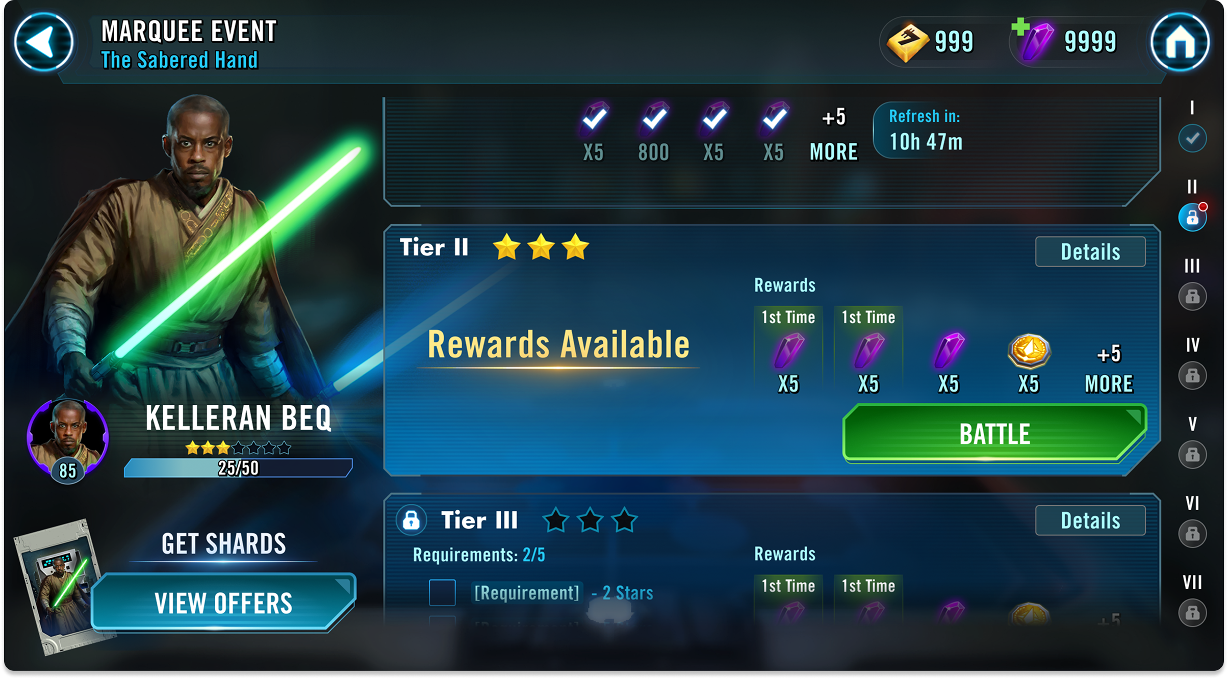
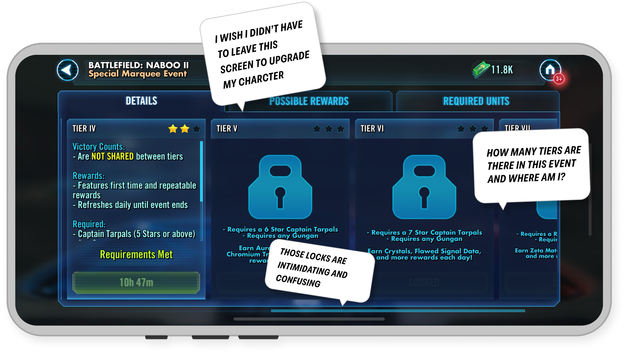
Motivation is highest at the moment players are most likely to leave.

Episode Track